

One of the more rewarding opportunities that I’ve had is working on a great team to help a local startup, HempX. HempX is a brand new platform for connecting people interested in hemp derived CBD products and vetted CBD producers of the highest quality. Our team was able to get in early and work with the founder of HempX and help him create a user-experience that helps customers build trust and understanding of the product, while also providing a trusted place for CBD producers to retail their product and build brand equity.
Role: UX Researcher; Visual Designer; Interaction Designer
Technologies Used: Sketch, InVision; Principle; Adobe After Effects; Miro
Starting Out
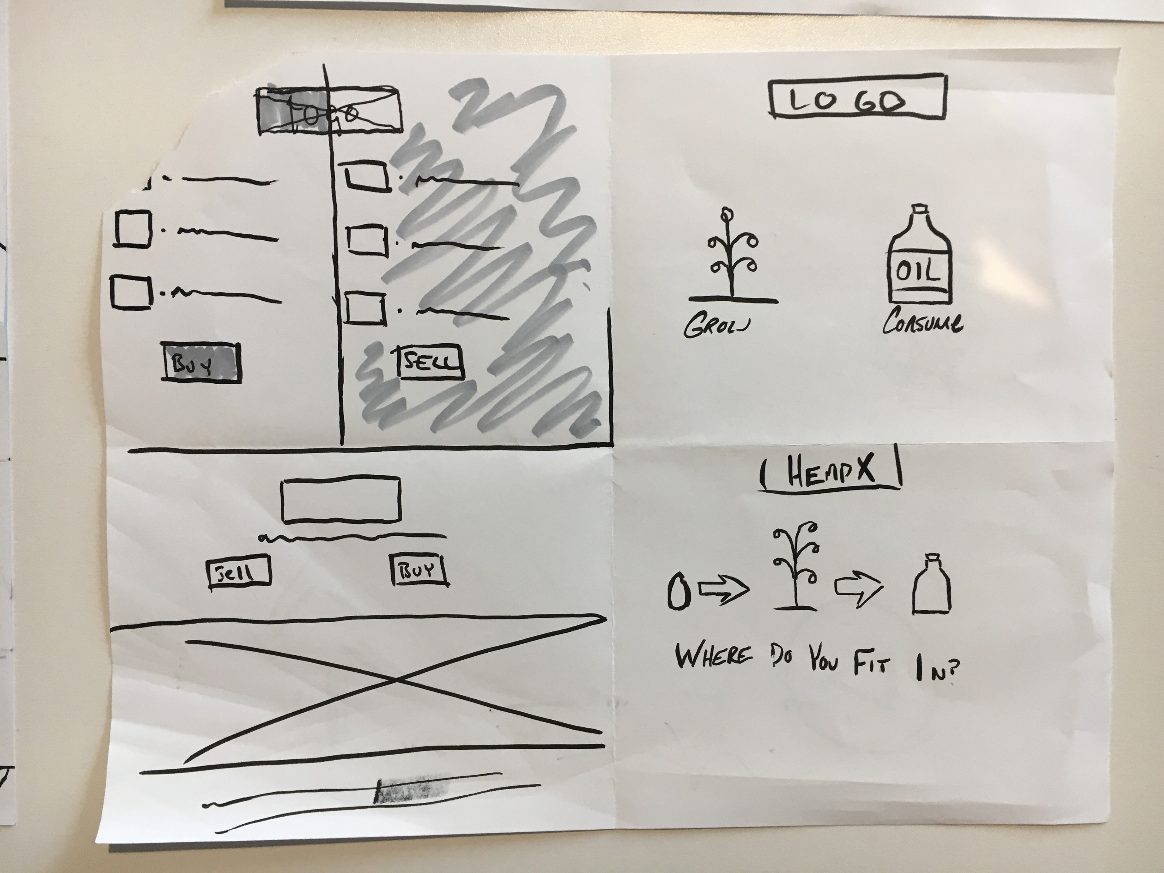
We began by meeting with Gerry Dumani, founder and CEO of HempX, and hear about his vision for HempX. Gerry’s vision is simple; a platform that helps hemp growers producing CBD based products become compliant with regulations surrounding the industry and distribution, while also offering consumers a place to learn about CBD and how it could help them and suggest vetted products to address their needs.
Gerry had great ideas about innovative features not currently offered within the space as well, such as web based doctor consultations that required research to validate. These ideas included a product wizard, and doctor recommendations. He also had some very basic wireframes that another designer had created. Essentially our team had a blank slate to work with, but a few things became clear in our meeting. Gerry wanted us to design an e-commerce store that would help position HempX as an expert in the CBD space effectively build trust with consumers.
We then scoped the project and decided that we would focus on the customer facing aspects of the design for our three week sprint. The first week would be spent researching and validating ideas while simultaneously beginning the design process with a goal of having personas and being able to start wireframing by the end of the week. Week two would be dedicated to fleshing out the features that we had validated and decided to include in week one, with the goal of having medium to high fidelity prototypes ready to test. Week three was reserved for usability testing and iterating, with the final concept presentation following.
Research
Research started with group planning and working on a strategy for gathering data. We had a few key goals. We wanted to figure out what was important to people interested in CBD products, what would help them build trust with a portal, and finally, whether or not the features that we and Gerry had in mind were viable.
We started the research process by soliciting survey responses and conducting interviews.

Age Range of Respondents
Respondents also came from all corners of the country.
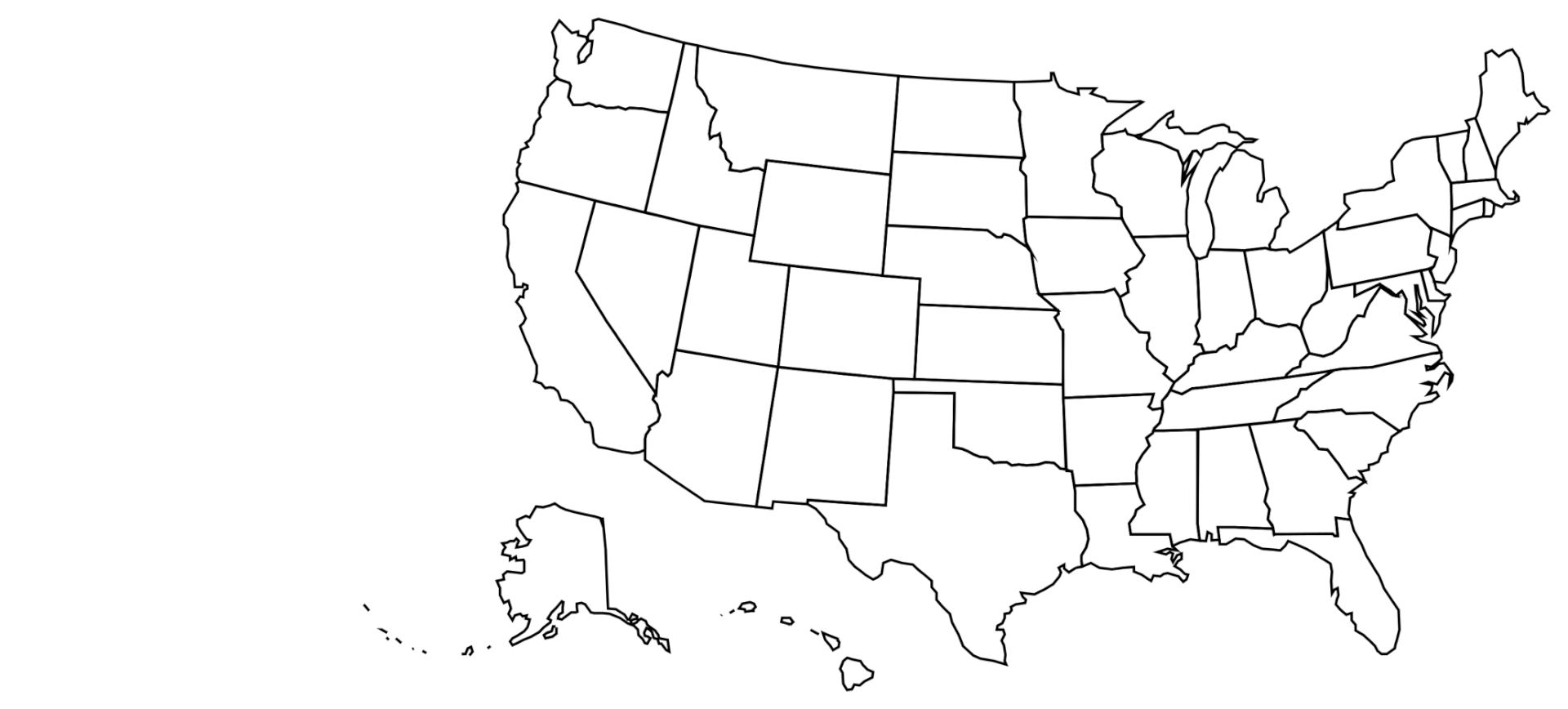
We received responses from six different states.
We gathered great insights including consumers preferred consumption methods as well as a general idea of what would keep them from purchasing a product.

One of the features that Gerry had wanted to include was doctor recommendations, and he put us in contact with a doctor that he had previously spoken with, as well as a CBD producer that he had already partnered with Happy Buddha Hemp.
The resulting data told us that Gerry had been on the right track with trust building. Most consumers wanted to be able to trust that they were getting quality independently tested CBD products. Since the consumers were so health conscious ensuring organic and responsible farming were key.
Regarding recommendations from doctors we found that consumers had issues with trusting a “random internet doctor.” In our efforts in communication with the doctor contact provided by Gerry at HempX it became apparent that the time commitments required by HempX would be too much to ask of a working physician as well. These factors made us reconsider recommendations and endorsements entirely.
We determined that HempX would have to position itself as the expert and provide recommendations based off of information provided by the customers. This necessitated a wizard function in addition to regular filtered shopping.
We determined that HempX would have to position itself as the expert and provide recommendations based off of information provided by the customers. This necessitated a wizard function in addition to regular filtered shopping.
Personas
With the data synthesized, we were able to create two separate personas representing the two main users we identified.


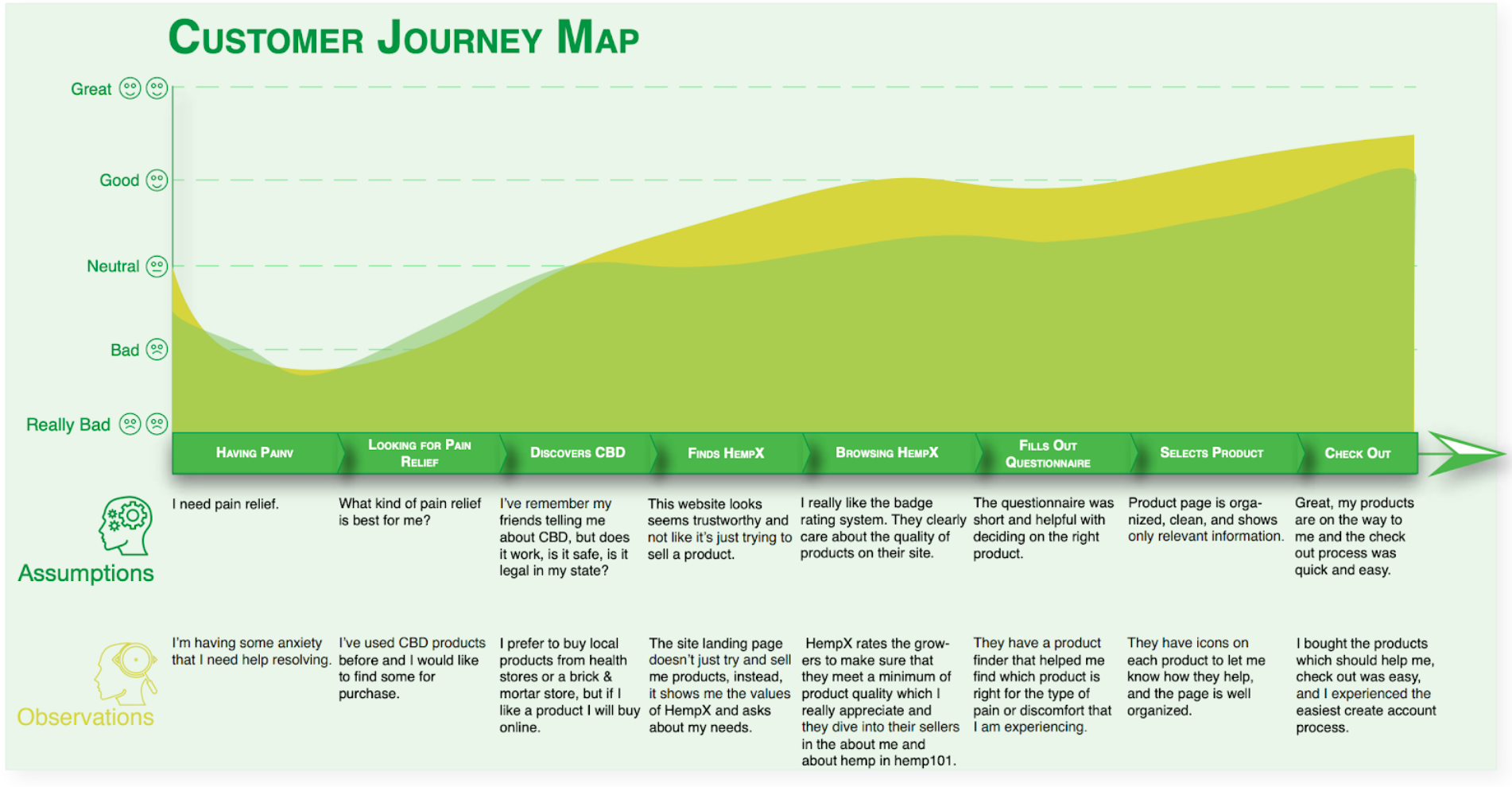
With both personas created, I was able to create user flows to help give the team an idea of how to move forward wireframing. We collaborated as a team to create journey maps as well to help emphasize what our design needed to address.

Designing
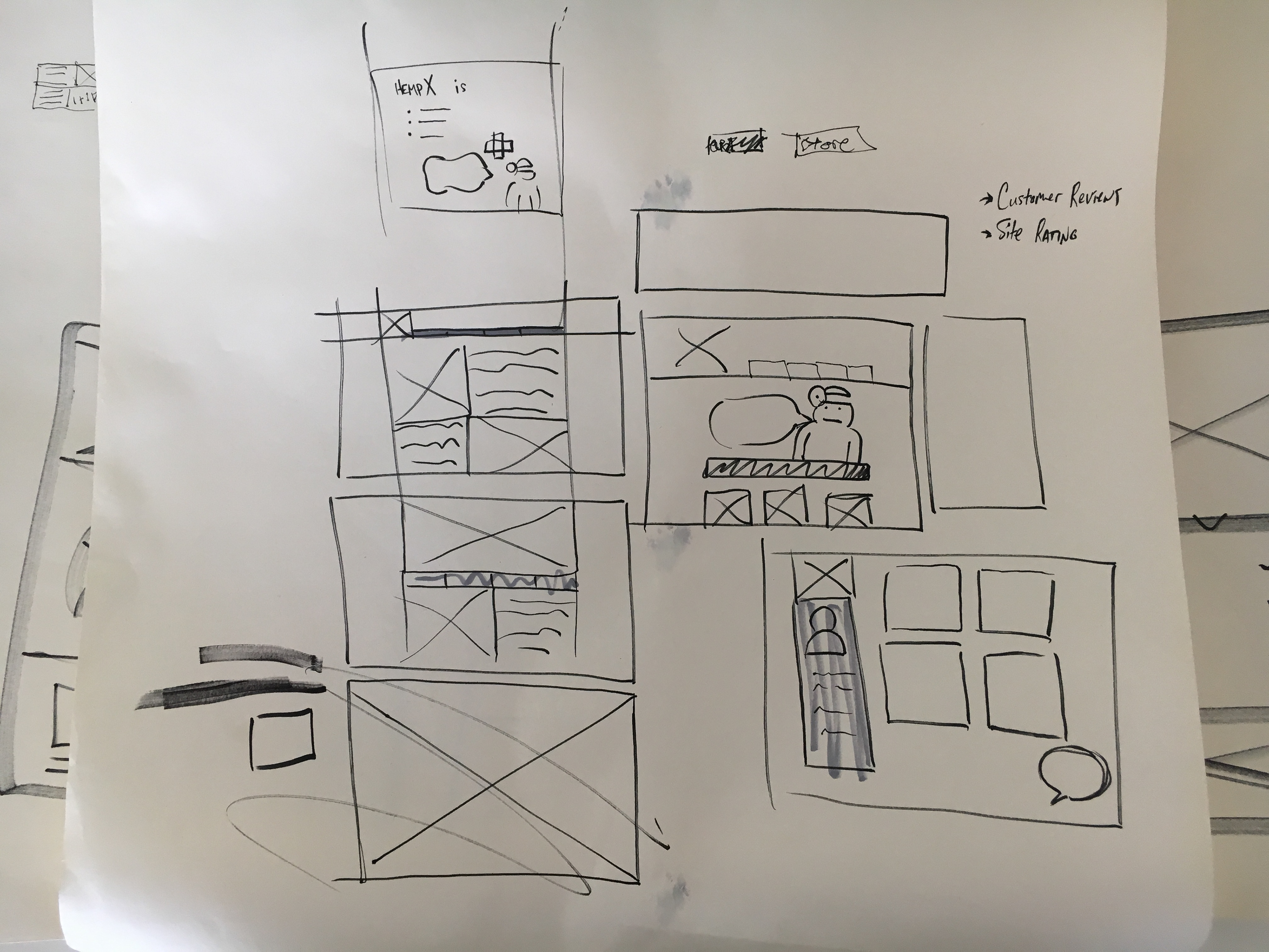


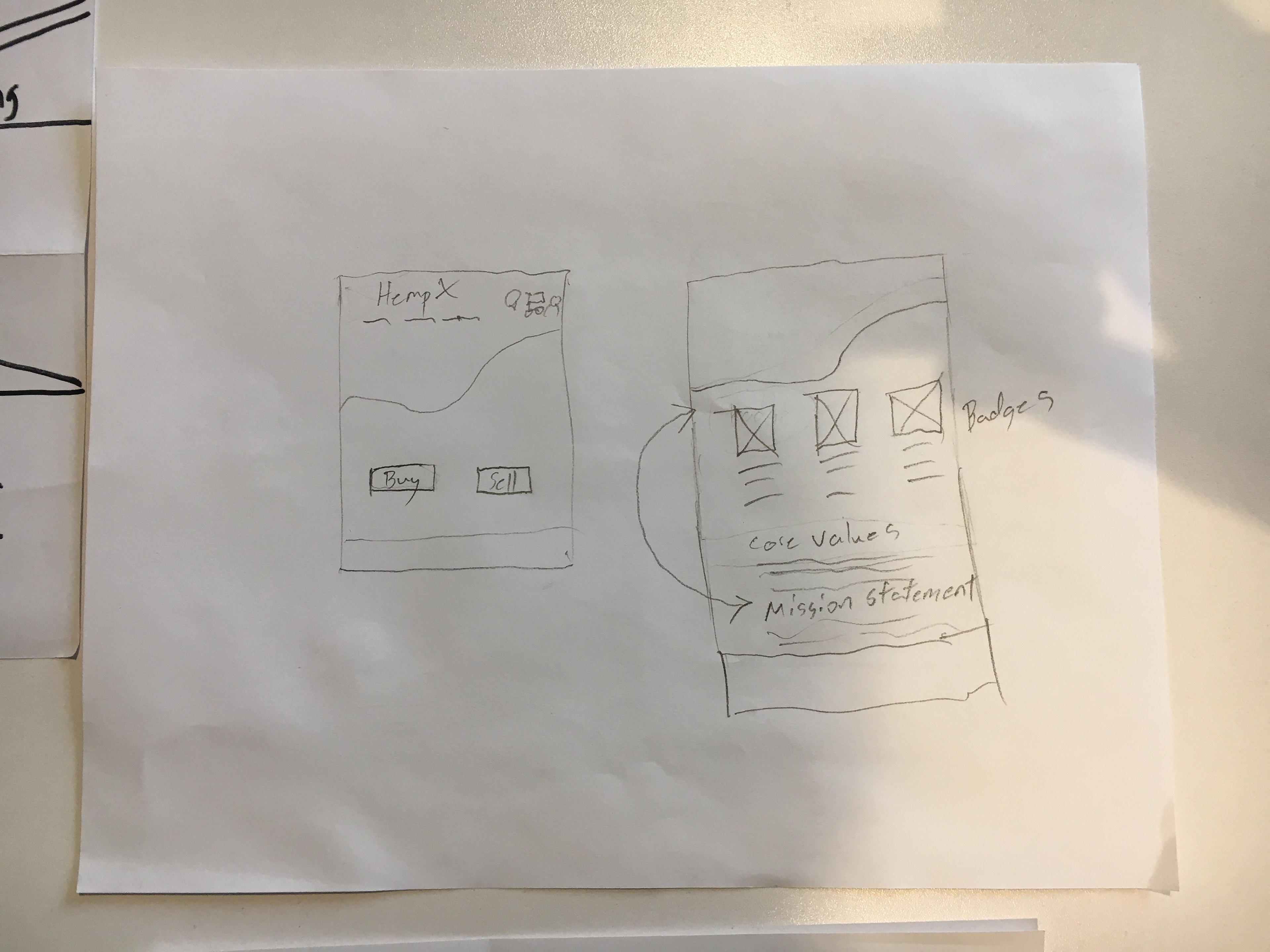
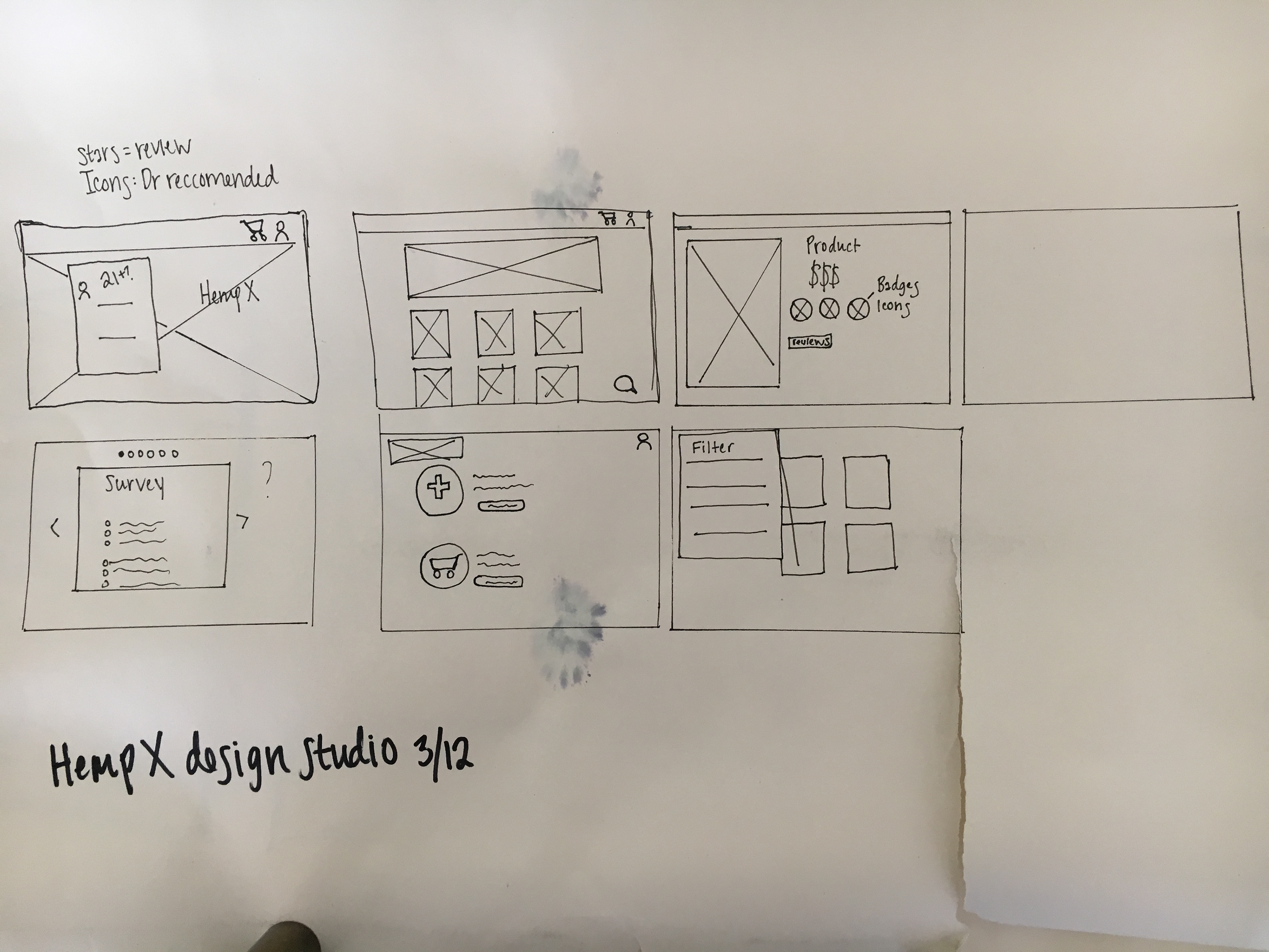
With an idea of who were were designing for and what are design needs were, we began beforming design studios to inform our future wireframes and mockups. Once we had a consensus of a design direction my colleague Libby made some excellent wireframes. We moved forward on a design we liked and developed a color palette using pastel colors in hues that are proven to provide calming and gentle feel. Green hues in general are shown to imbue feelings of health and serenity.

Branding

Initial branding provided by Gerry Dumani.
I wanted to focus on developing some branding concepts that followed the overall aesthetic that we wanted to accomplish. Gerry had some initial branding but was sure to convey that we were free to try and come up with other concepts. Due to the multi colored nature of the logo it would not work with our soothing green colors. I struggled with coming up with a design that conveyed feelings of health while also appearing natural and organic. I toyed with the traditional idea of the prescription “Rx” but could not get it to work.
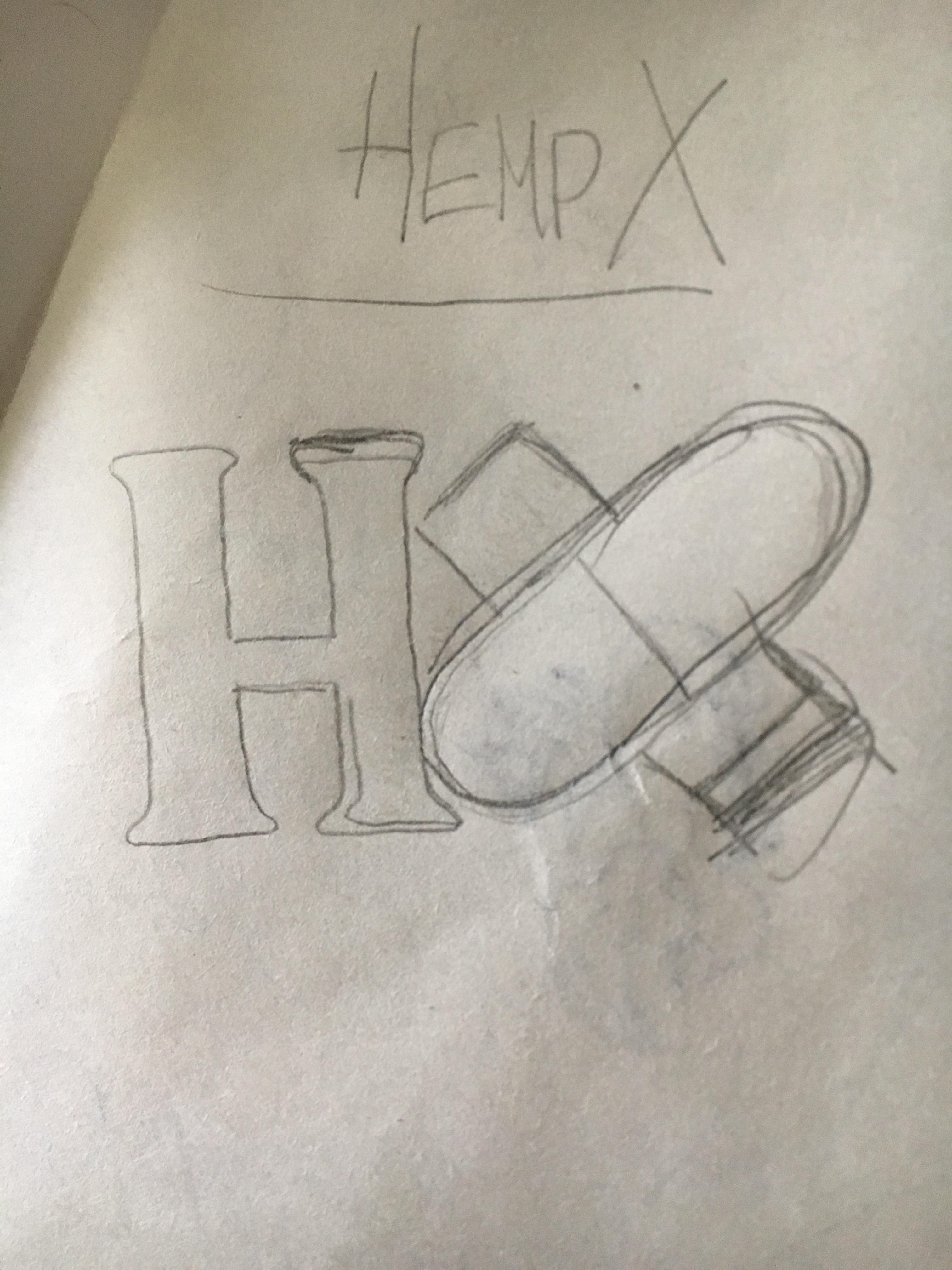
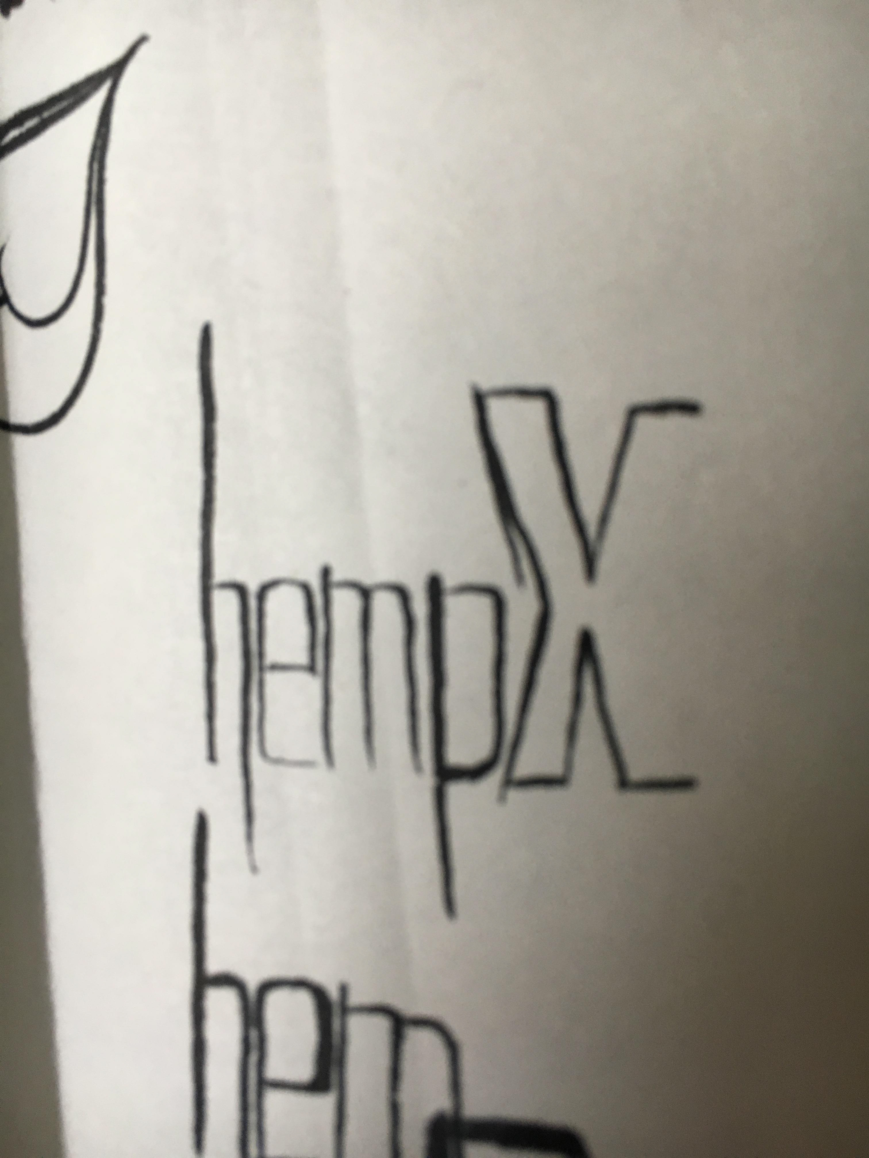
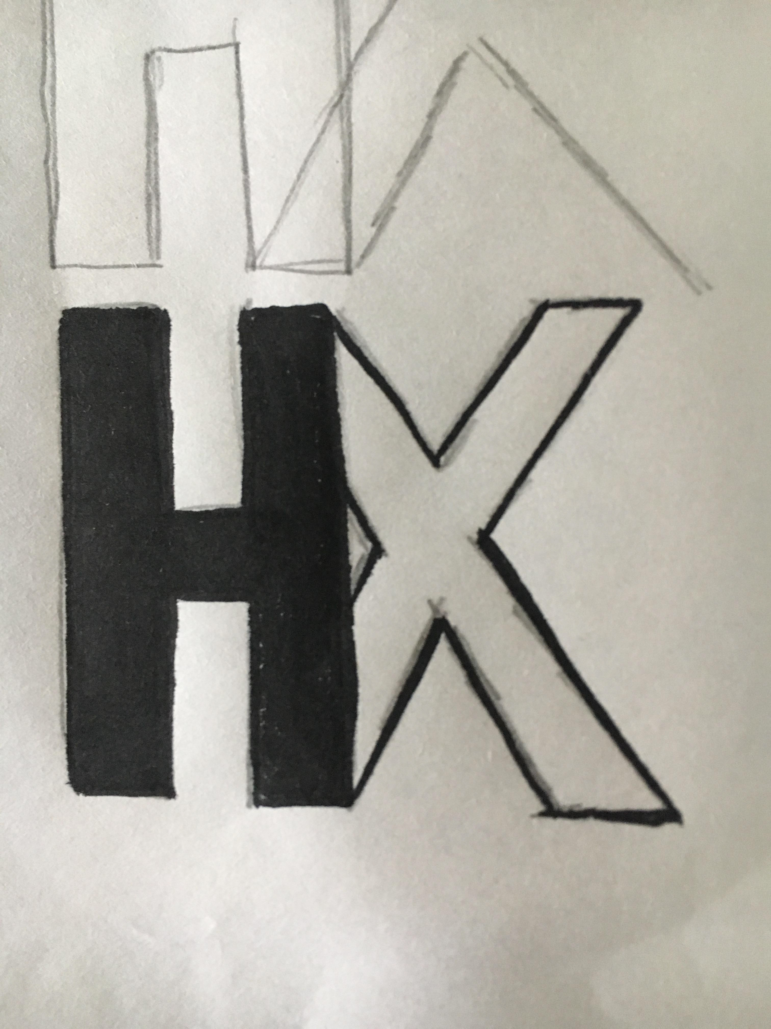
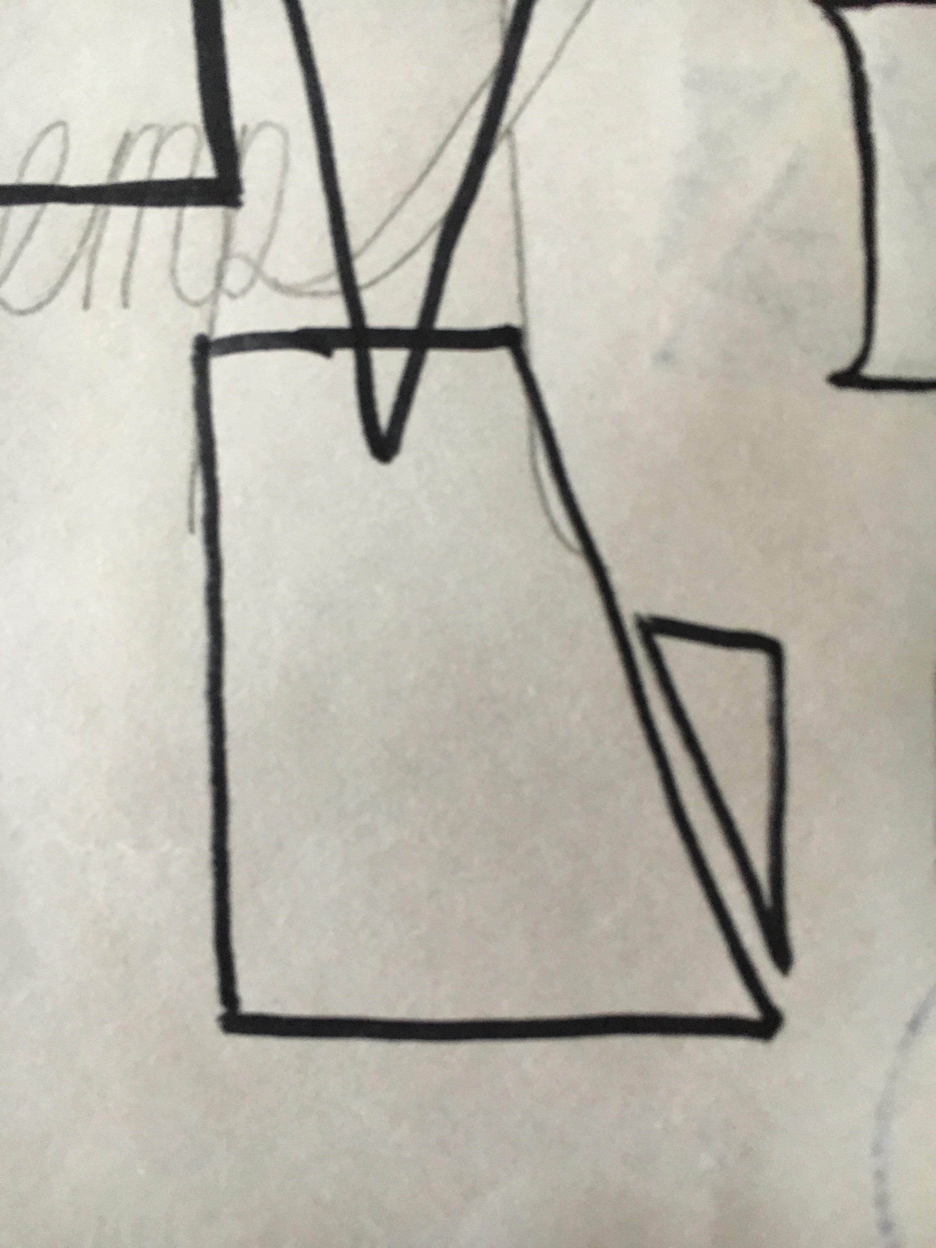
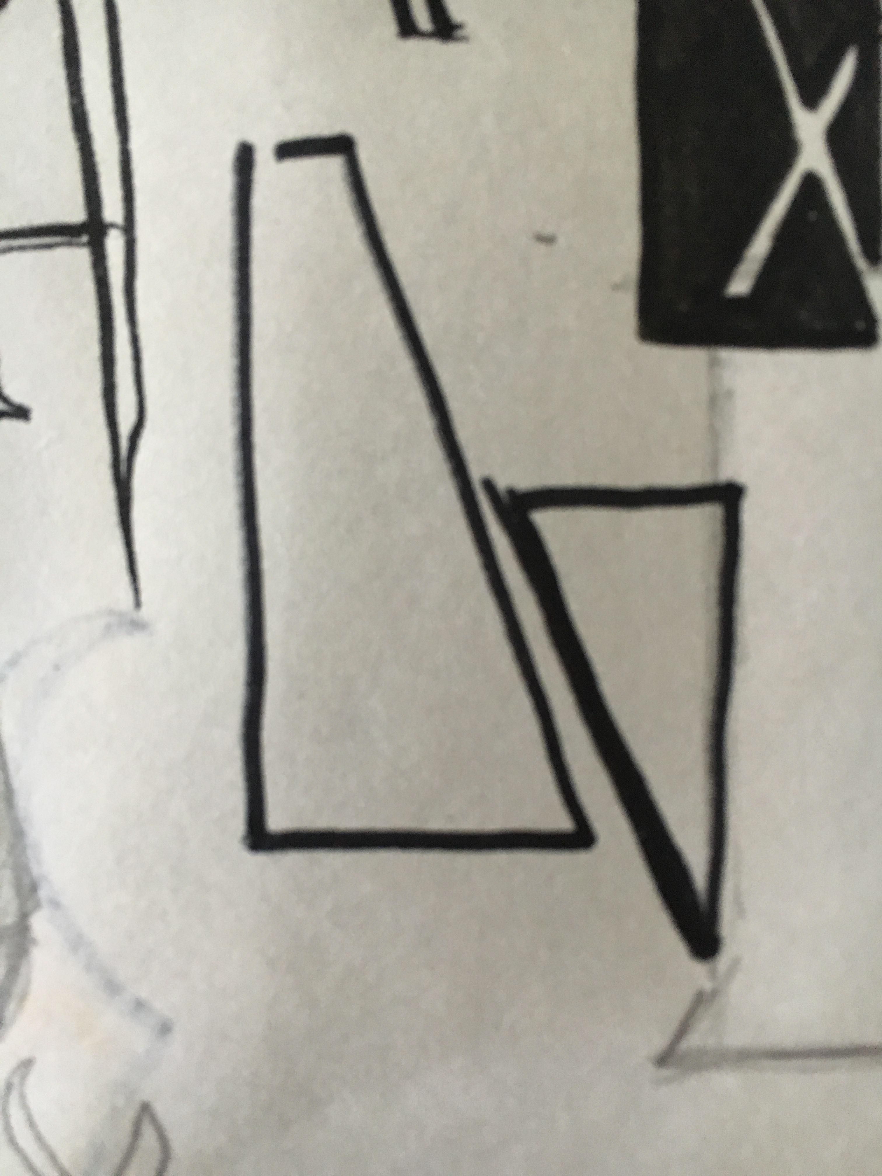
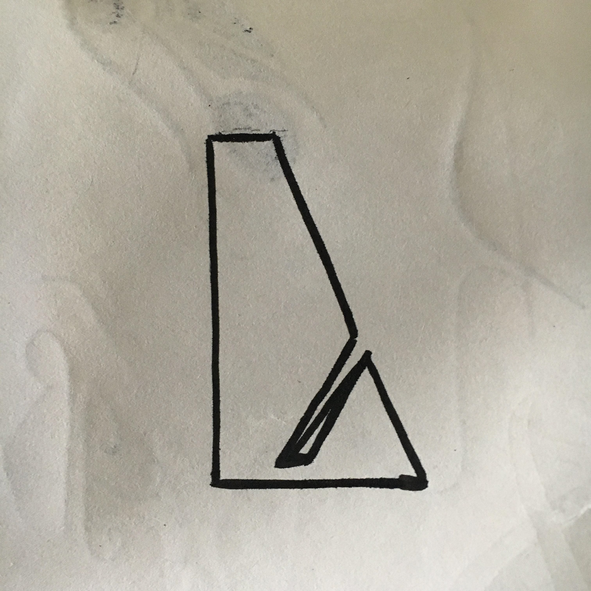
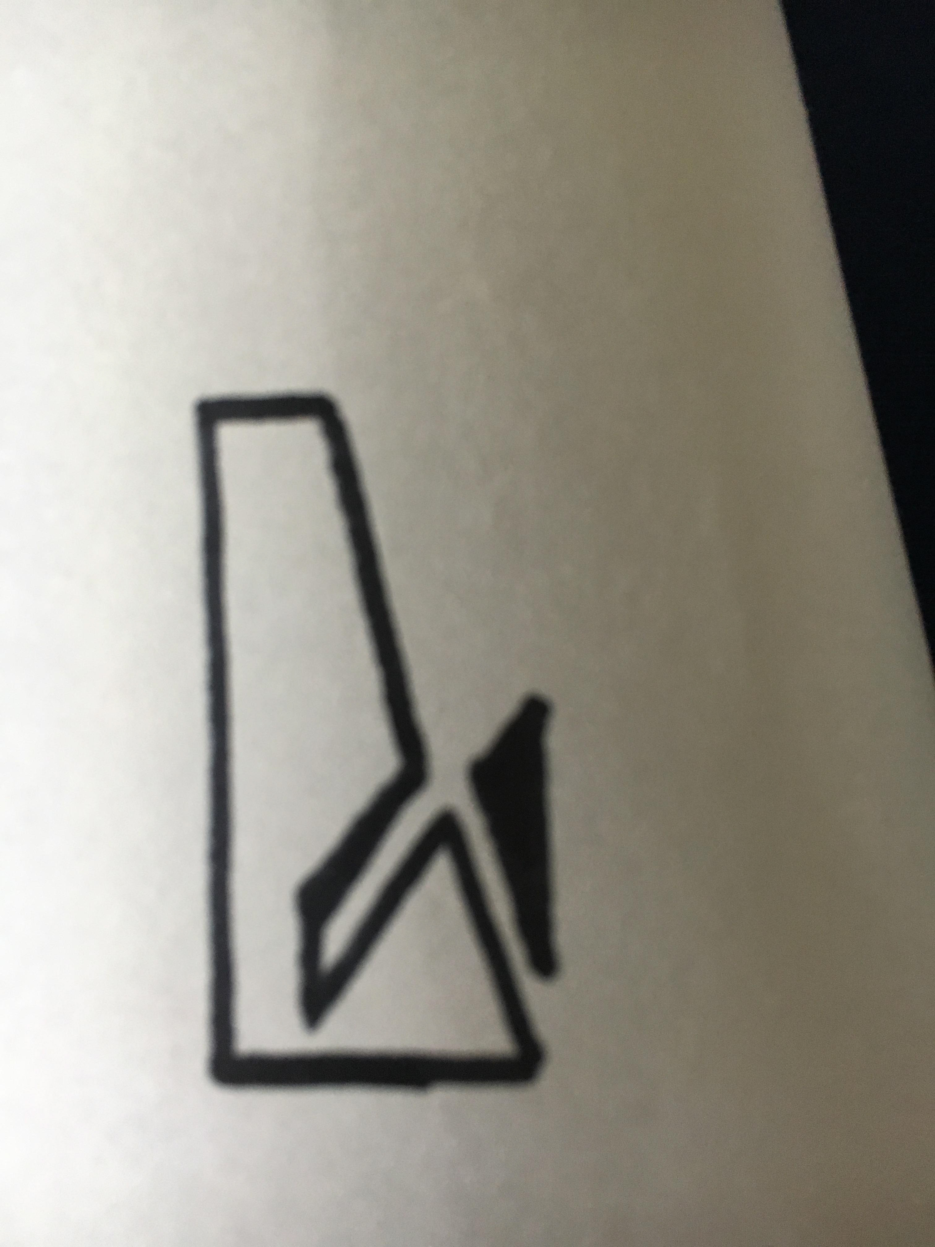
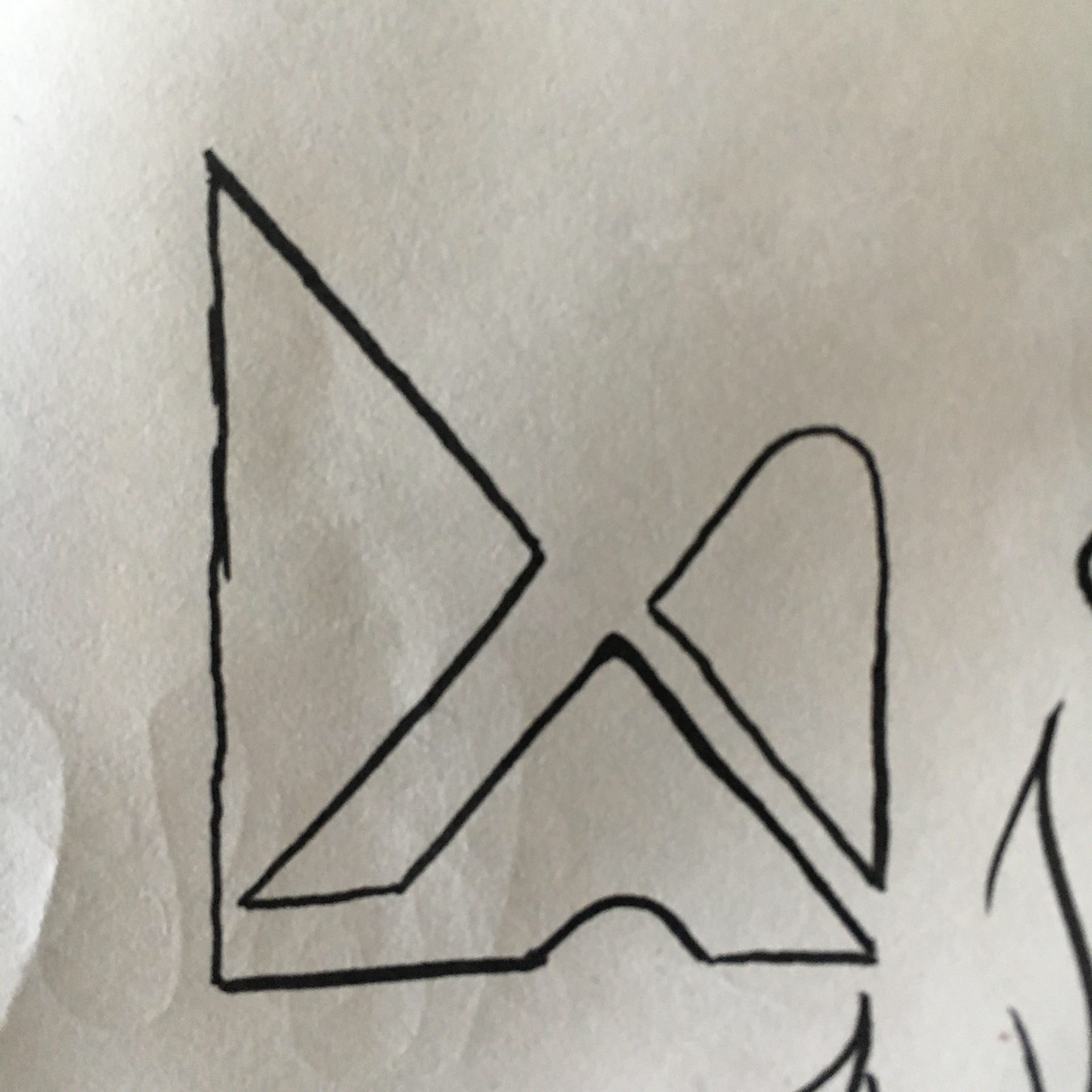
I eventually settled on a concept using shapes to create a negative space “X” while using the font from Gerry’s original logo. I felt that using the same greens from the color palette suggested leaves. I toyed with rounding corners and striations to take that organic feel further, but felt that the striations took away from from the negative space “X” while the rounded corners gave the desired effect and make the logo fit in more reasonable dimensions.

First Concept.

Striated.

Final Concept.
Prototyping, Testing, and Iterations
Wizard: We were able to stay on our schedule with this project, meaning that we made a number of iterations through the course of design. One of the first areas test was our product suggestion wizard. The wizard needed to be brief, engaging, and help users identify products that can address their needs.
Our first iteration was text based. At this point we were focused on what questions to ask and and keeping it brief. However as the design progressed we felt this was not enough to build the trust needed. We felt that iconography in addition to the text would help because we could then apply those icons to the product pages to help users associate different products with different health needs.
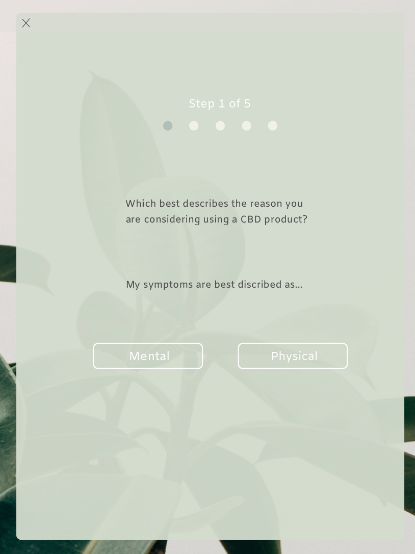
Original version of product suggestion feature.
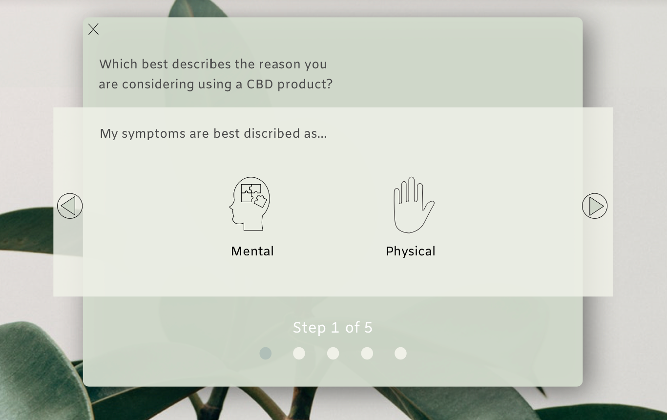
Final Iteration of product suggestion feature.
Additionally, we changed the title of the page designed to address consumers concerns about CBD from “FAQ” to Hemp 101 as this proved to be more inviting to engage with.
Splash/Home Page: The initial design for the splash page featured too large a hero element, so despite featuring more content lower on the page, usability testing showed that users were not engaging with that content at all, and instead chose to navigate to a different page. Subsequent iterations feature a truncated hero element and scroll indicator, alleviating those issues.
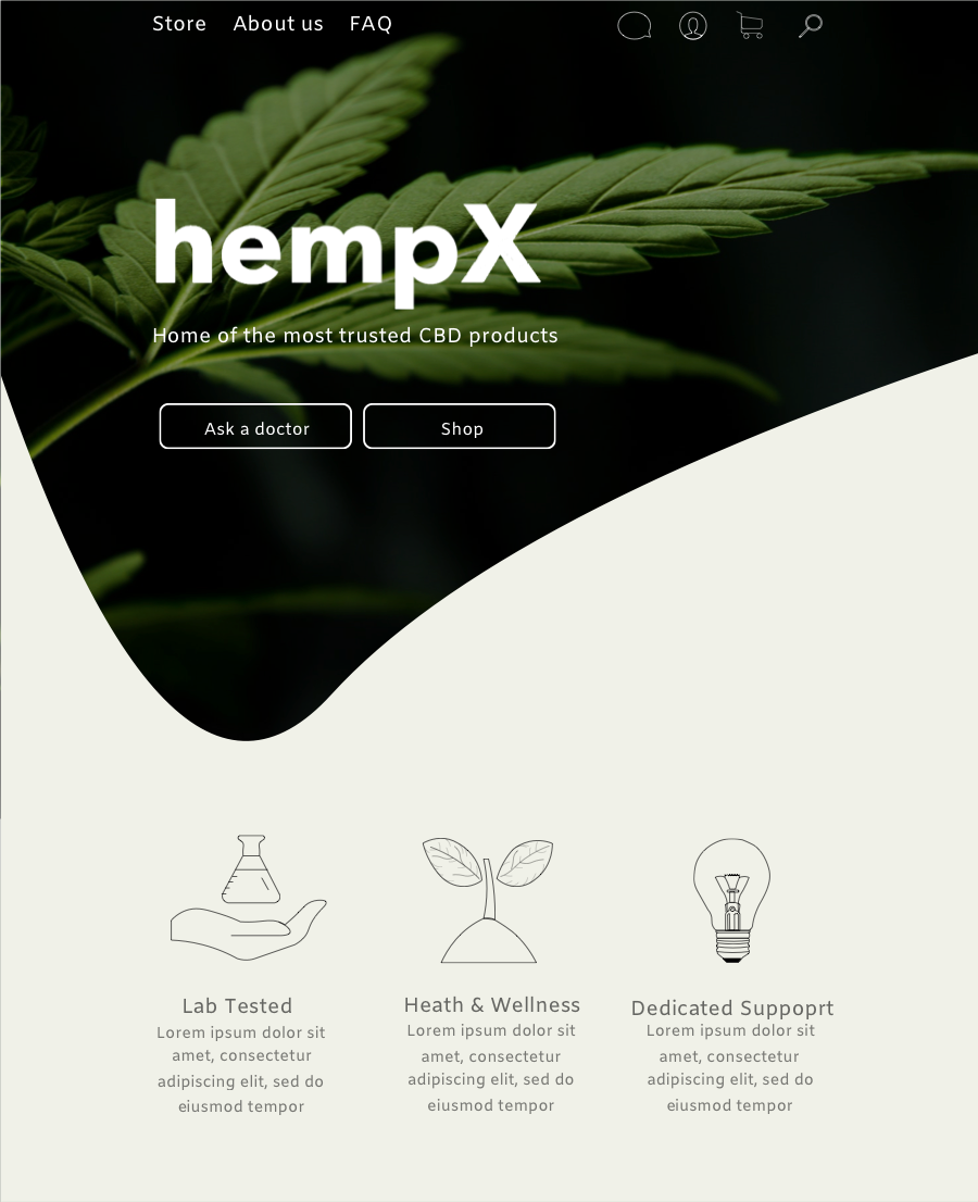
Early iteration of Splash Page

Splash page with updated icons.
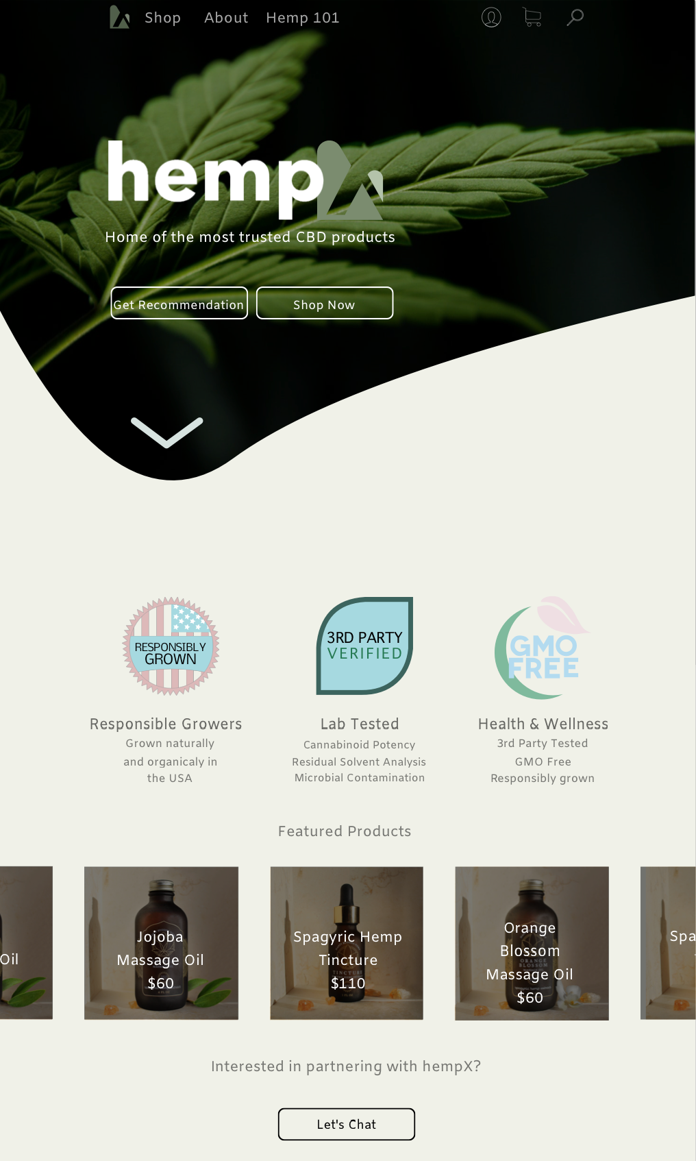
Final iteration of Splash page adding featured products.
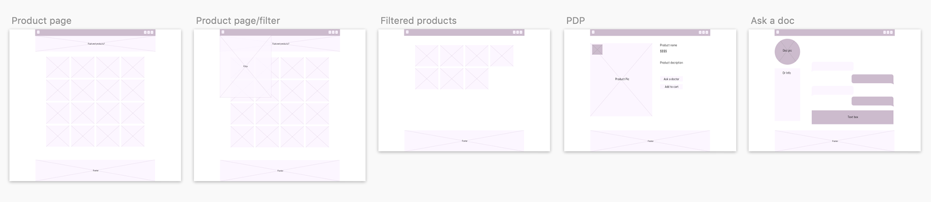
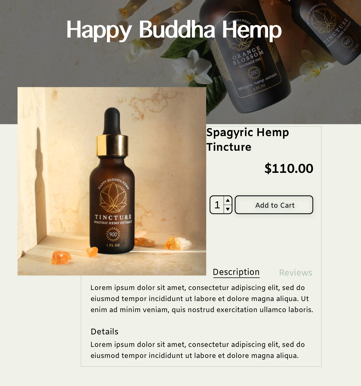
Product Detail Page: From the beginning, we wanted this design to have a clean and simple aesthetic, yet early Product Detail Page(PDP) designs failed to continue to build the trust that we had been working to build throughout the HempX experience. There was simply not enough use of the iconography presented earlier. Once we changed the wizard iconography, we found that using that could enhance the experience. We also wanted to be sure to use the additional iconography that indicated the organic and responsible nature of the products.
Early Iteration of PDP.

PDP with added iconography to help build trust and consistency.
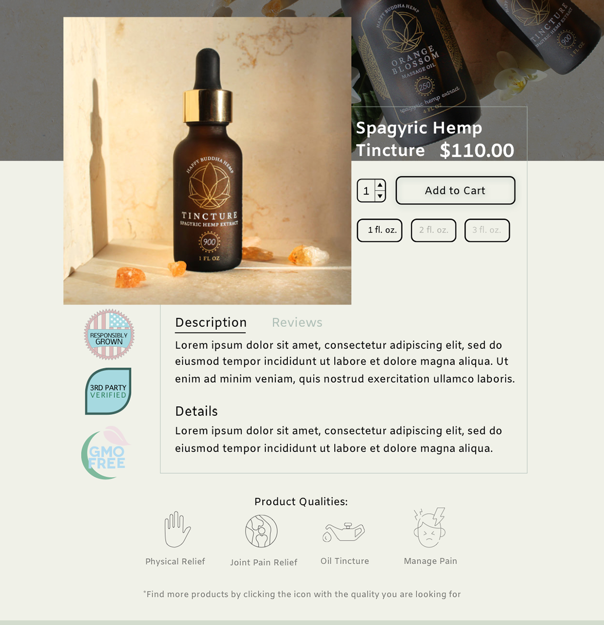
Final PDP with addition of product size selection at the request of Gerry.
Prototyping: We used two different types of prototyping throughout this project. We used clickable InVision prototypes to perform usability testing. However I wanted to add another level of realism to our design, so I spent a lot of time in Principle designing interaction animations.
Overview of work done in Principle.
Closer view of Principle prototyping.
Using Principle, I was able to add button backdrops with hover states, hover states with information on product cards, smooth transitions between pages, and element pagination on our splash page. In the end, we had fully animated concept to present to Gerry.
Reception
I felt that we were able to present Gerry and HempX with an excellent concept to move forward with. However that is not to say that there were not areas that he felt we could improve upon. Gerry was unsure of our branding expressing that he was unsure if it conveyed the full name of HempX correctly. Despite this, he was impressed with our ability to complete what he considered a minimally viable product that he could take to his development team and build upon.
Phase Two
Phase two would largely be the design of a mirrored experience for sellers interested in selling on the HempX platform as well as the UI for sellers creating a store and listing products. HempX should soon have a larger number of partners available to work in creating this design. It should however work toward the same goals as the consumer portal.
Phase two would also involve implementation and continued testing of nearly every aspect of this design. I felt the largest hurdle in this design was that we started from scratch. This gave us incredible freedom with design but left much to be desired in the way of data. Once HempX has a live marketplace the design needs to be continually examined for efficacy. The branding will have to be revisited and continued testing would be needed to ascertain its effectiveness. Perhaps the logo I designed would be better as a standalone icon while the name HempX remains a plain text logo.
Additional testing needs to be performed on the wizard with the following questions in mind; Does this provide value to customers? Does this provide valuable data to HempX and the partners selling on the platform? Do the results feel adequately tailored to the customers needs?
Phase two would also include the expansion of features, most notably to include user profiles and functions therein that would speed up the shopping process and provide and even further tailored experience for returning shoppers.
Reflection
In retrospect there were a number of things I would have done differently throughout this project. If I were in a role of Product Manager I would have split the team to work in tandem to create both the consumer and seller sides of HempX. While both designs may not have reached the same fidelity of the mockups delivered I feel that the value provided to HempX could have potentially been higher.