

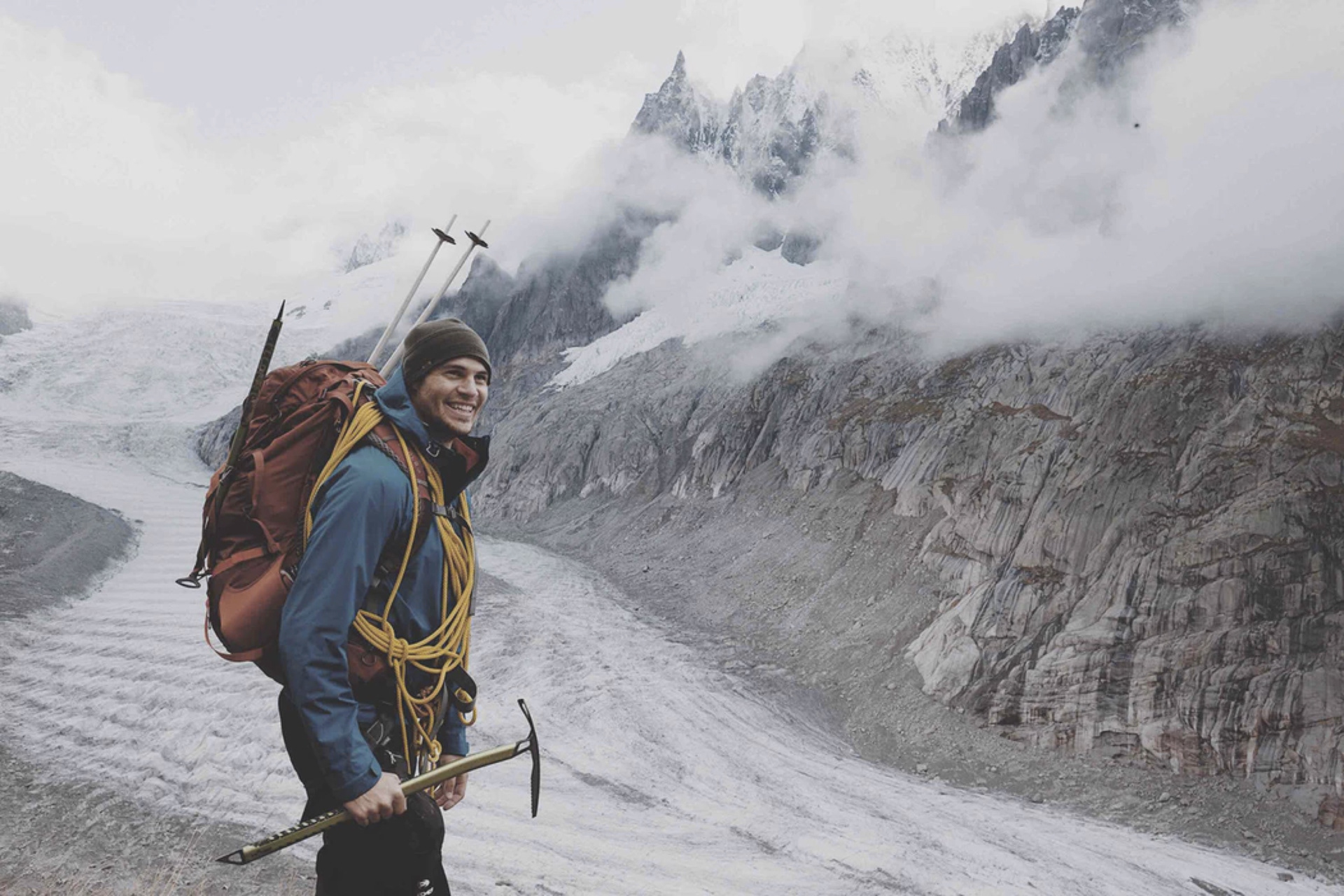
I was part of team tasked with creating an all-new mobile user experience for the Colorado Mountain Club to promote their organization and events.
Role: UX Researcher; UX Design
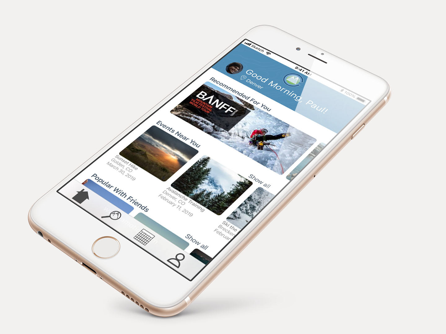
Watch Audrey Onboard as a new User
Started in 1912, the Colorado Mountain Club has been dedicated to getting Colorado's residents out and into nature. The CMC wrote their mission statement in 1912 as well and it remains unchanged.
"To unite the energy, interest, and knowledge of the students, explorers and lovers of the mountains of Colorado;
Collect and disseminate information regarding the Rocky Mountains on behalf of science, literature, art, and recreation;
Stimulate public interest in our mountain area;
Encourage the preservation of forests, flowers, fauna, and natural scenery; and
Render readily accessible the alpine attractions of this region."
My team's task was to translate the Colorado Mountain Club's comprehensive website into a mobile app that provided users with a seamless experience when finding ways to interact with the Colorado Mountain Club, and to provide the club with a way to continue fulfilling their mission statement.
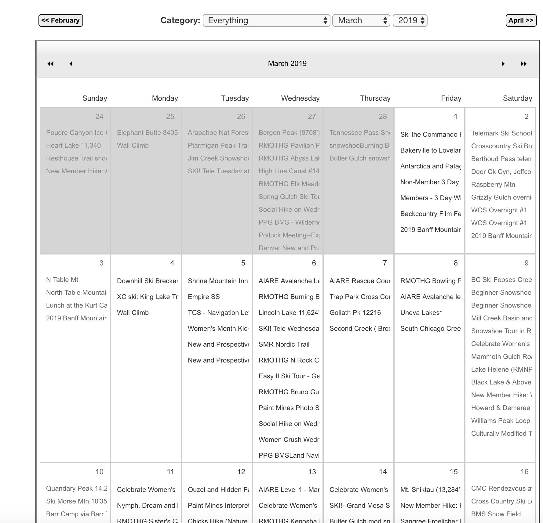
A sample of the Colorado Mountain Club's very busy calendar.
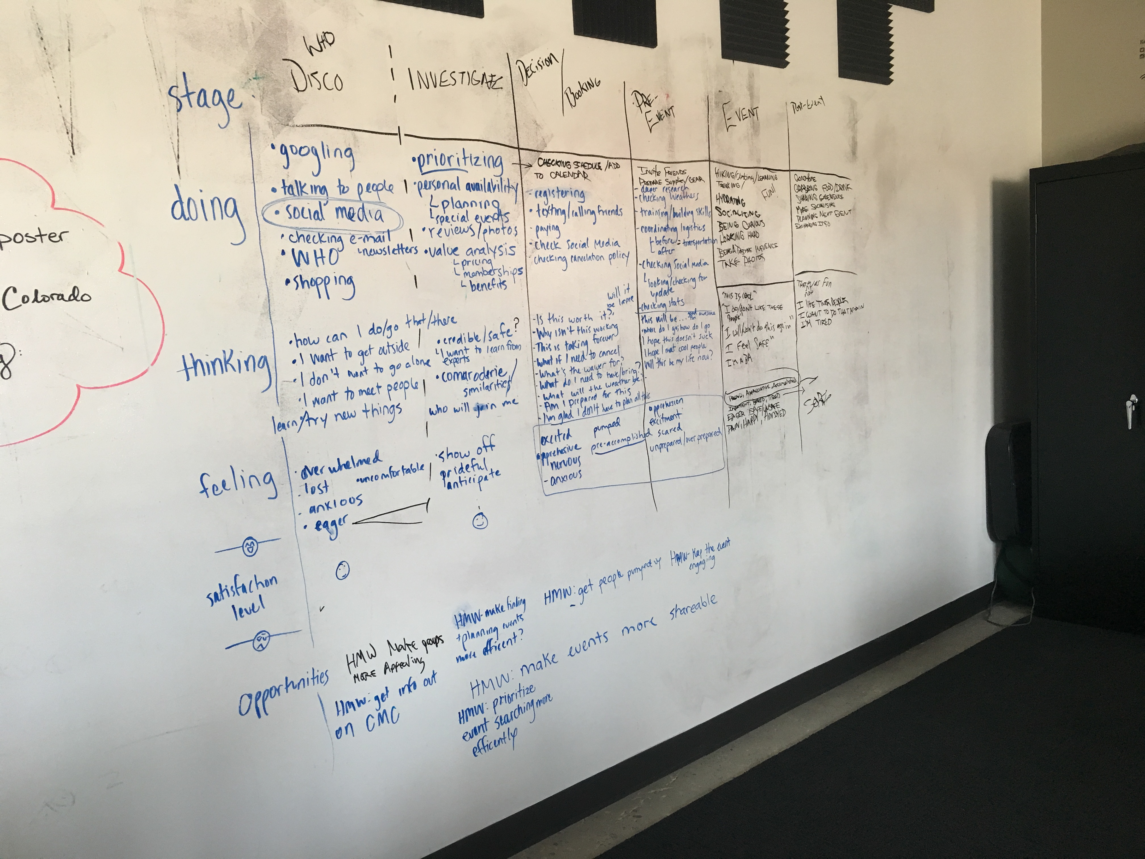
We started research by examining Colorado Mountain Club's website and creating an assumption based journey map to help us construct interview and research strategies moving forward.
Once we felt we had good strategies in place, we began conducting field interviews, sending out both targeted and general questionnaires, as well as less traditional research methods such as seeking out unsolicited opinions on websites such as 14ers.com.
Alongside that research, we performed in-depth analysis of the CMC website and formed a list of competitors to find what they did well and poorly. We decided that the best approach to this was to look at direct competitors in the field of outdoor recreation like REI.com, as well as some more experience based services such as AirBNB Experiences, Groupon, and Eventbrite to find out what they do well.
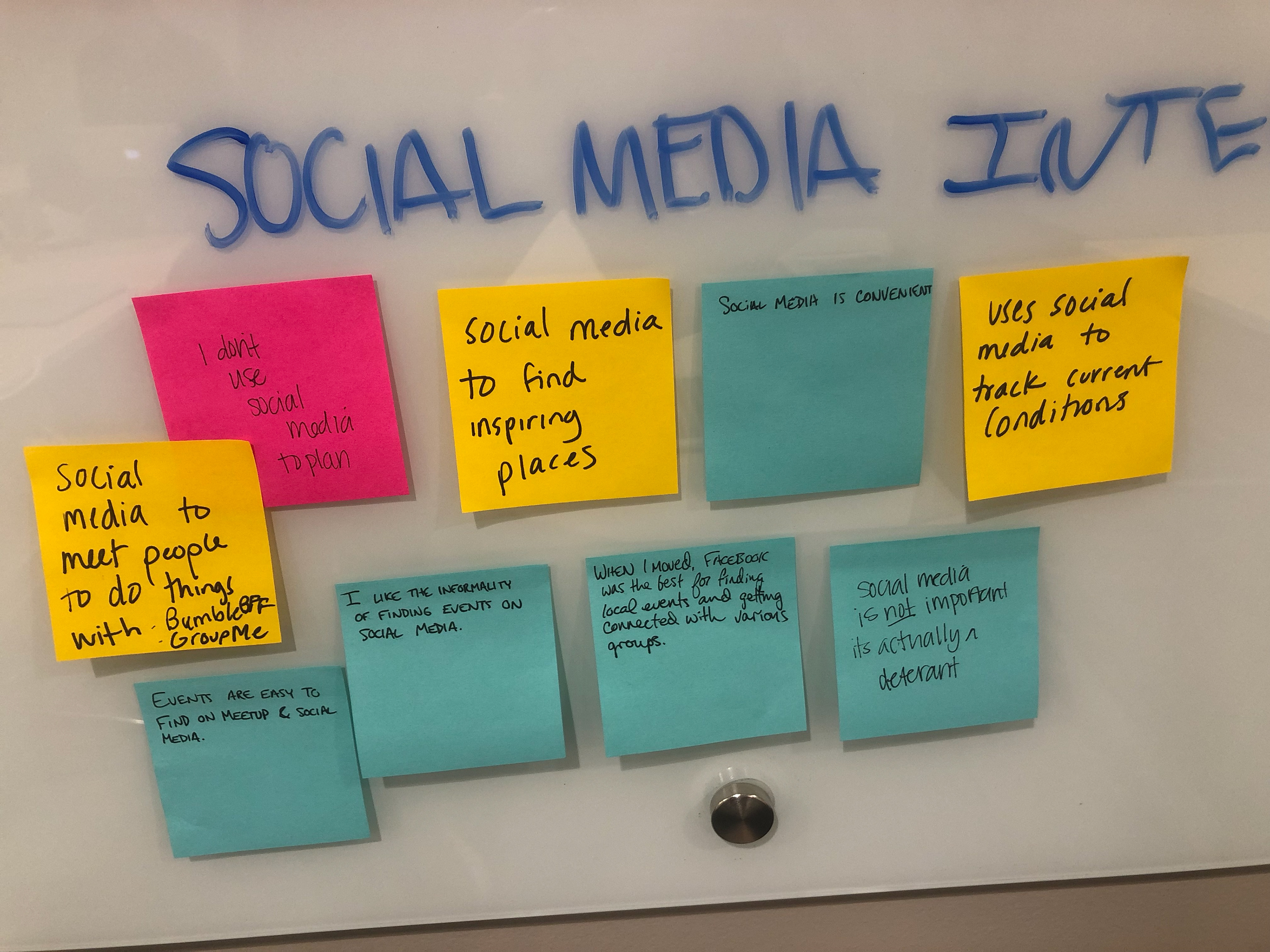
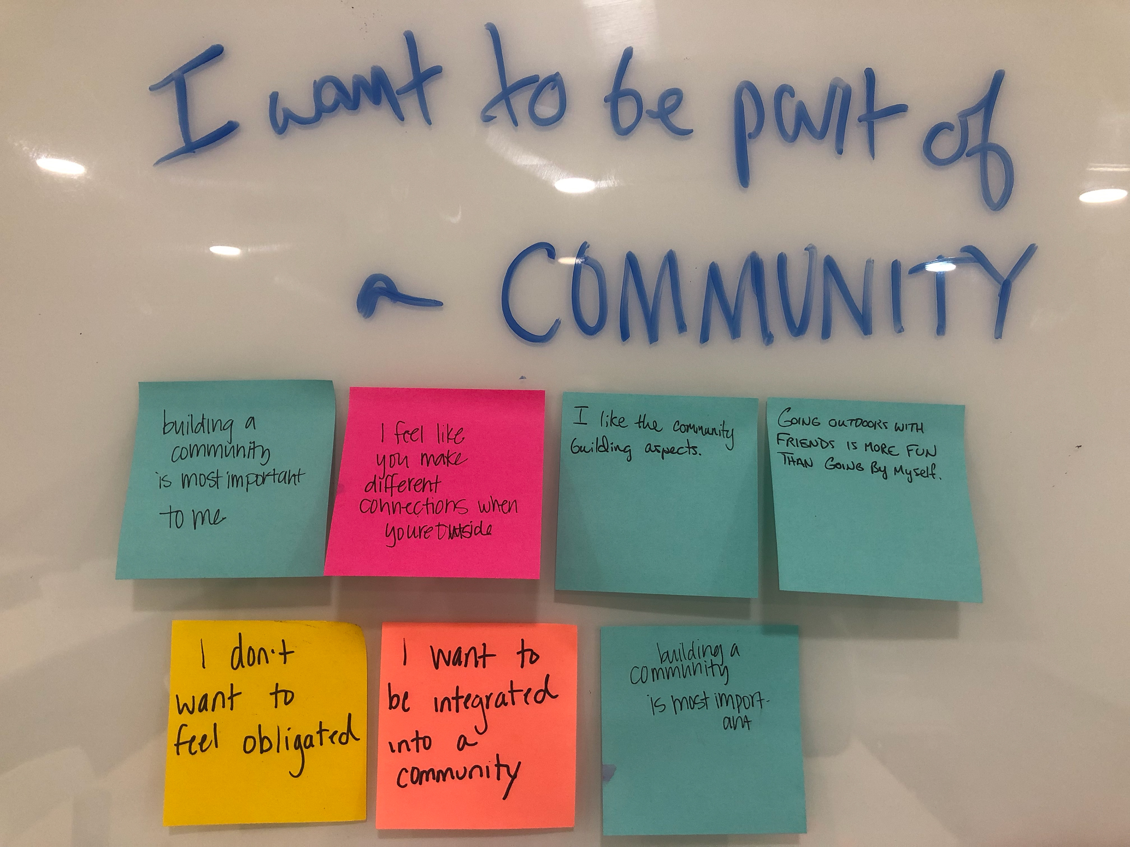
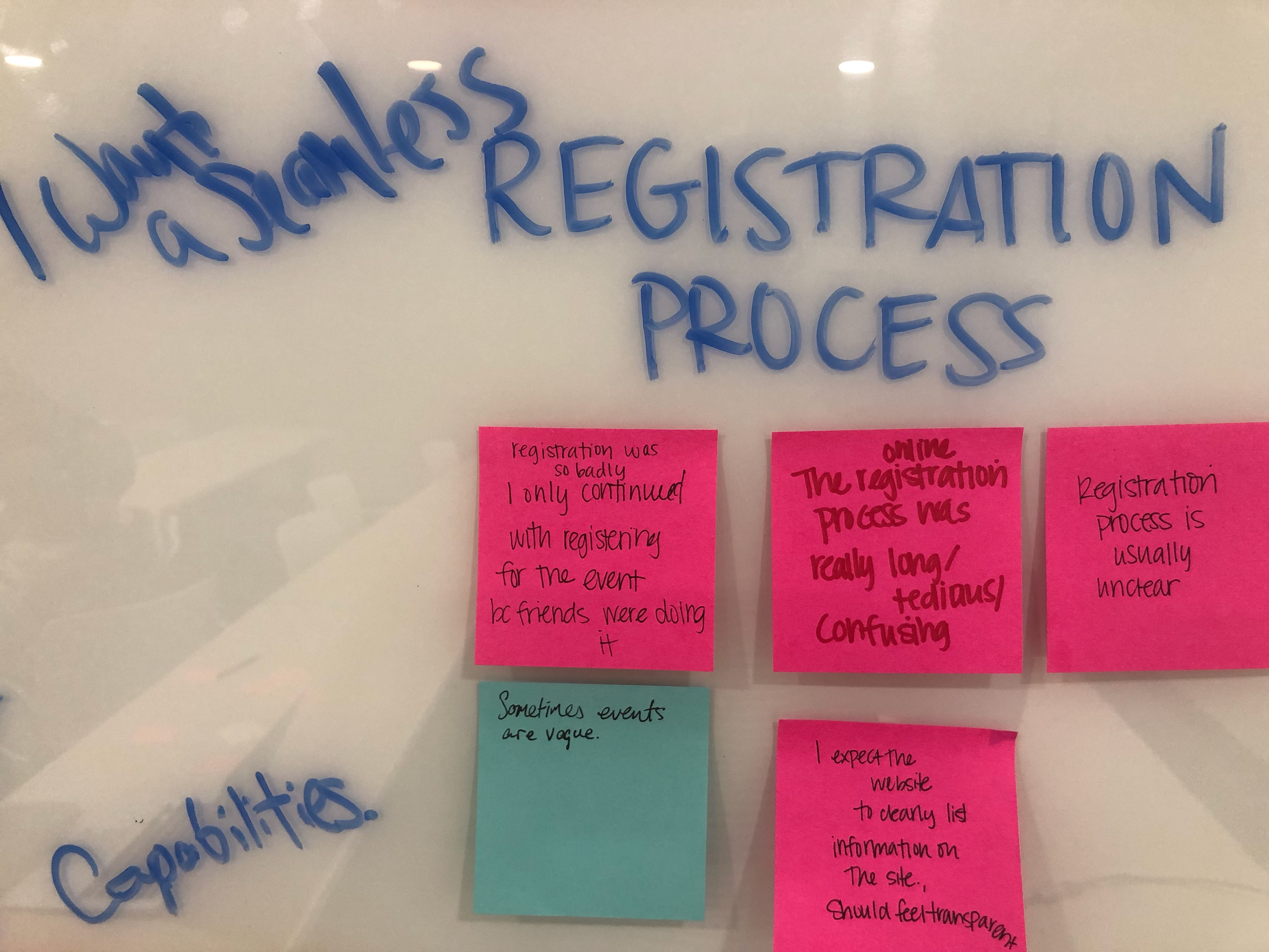
Synthesizing the Data
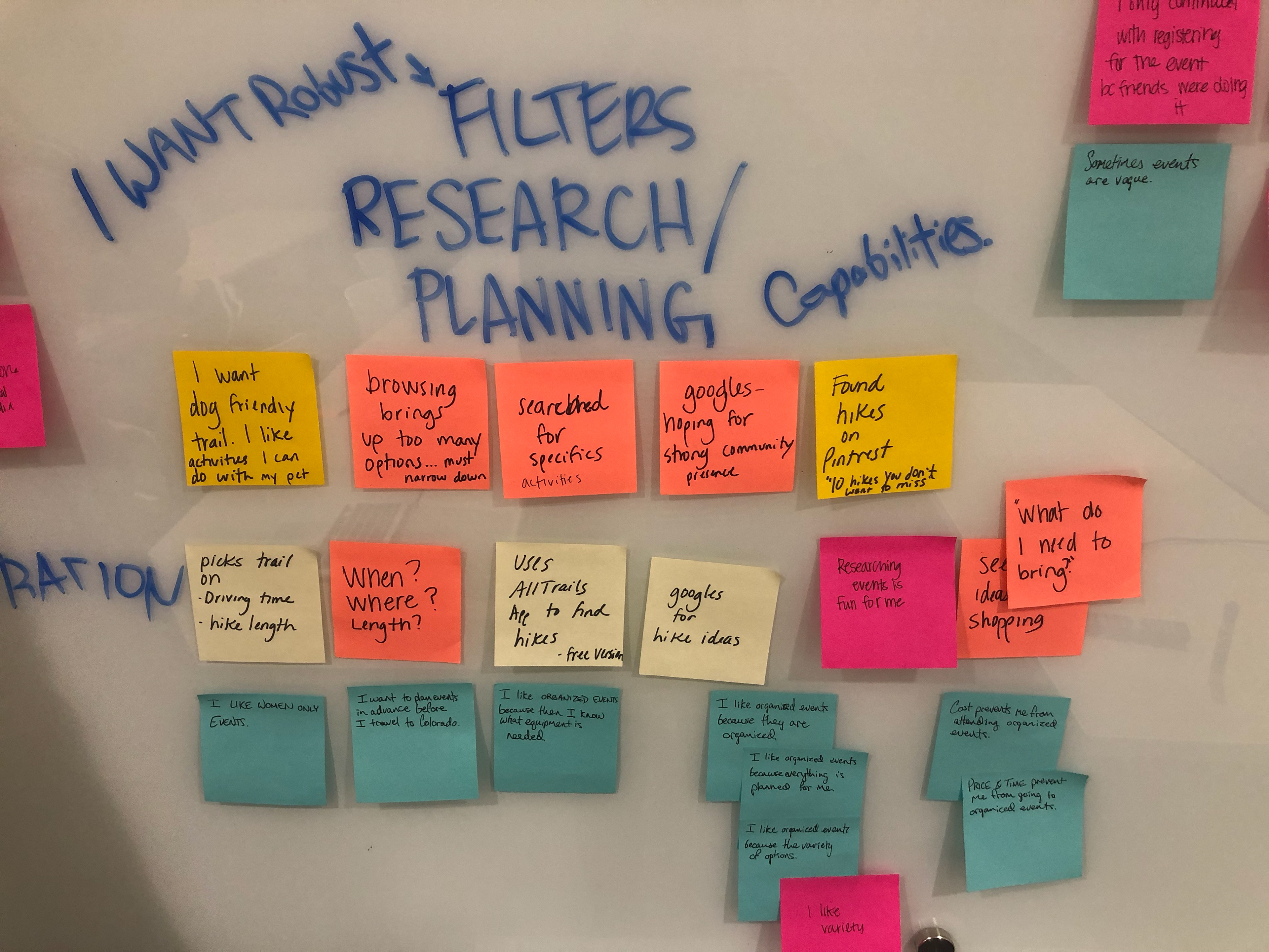
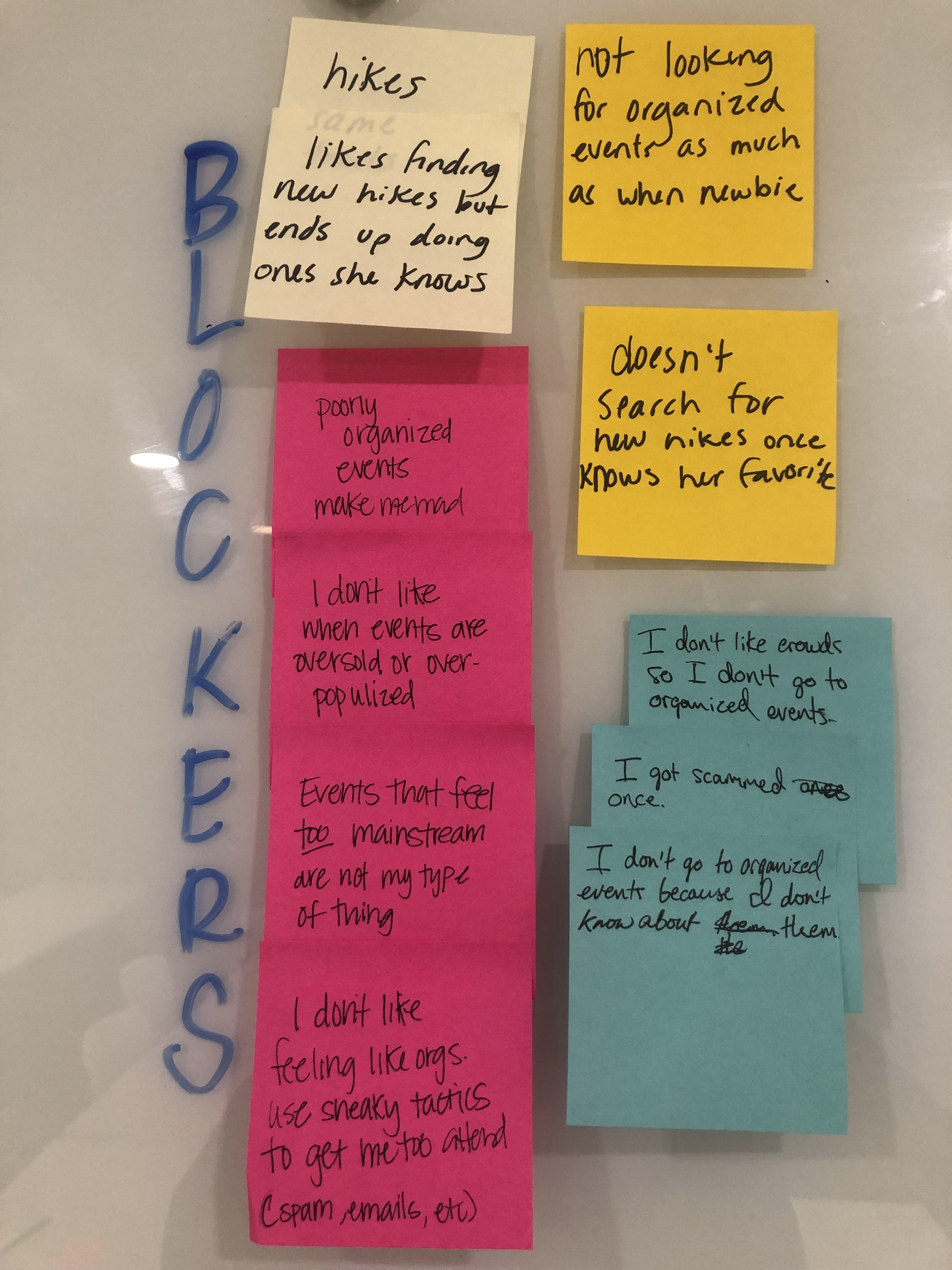
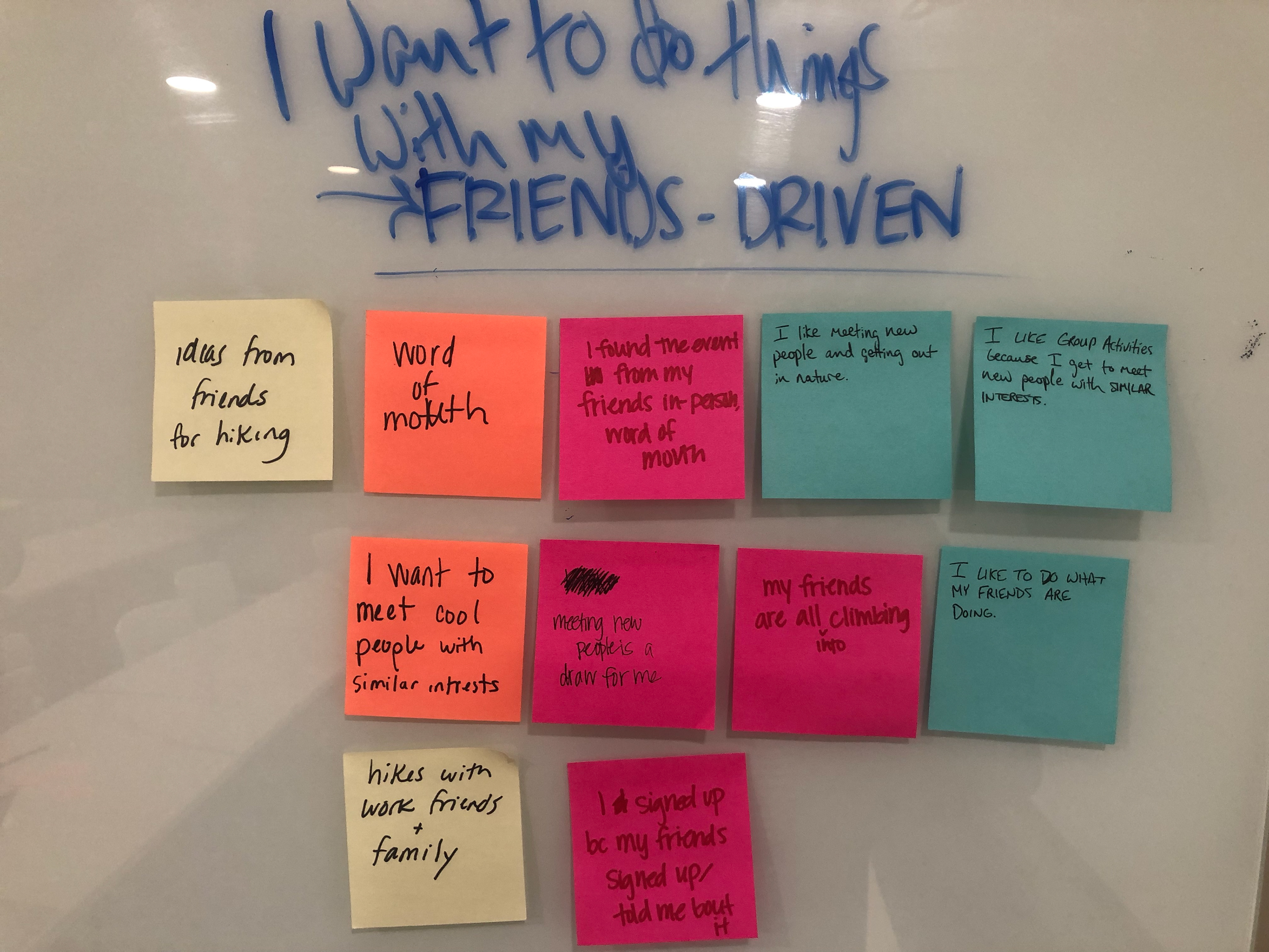
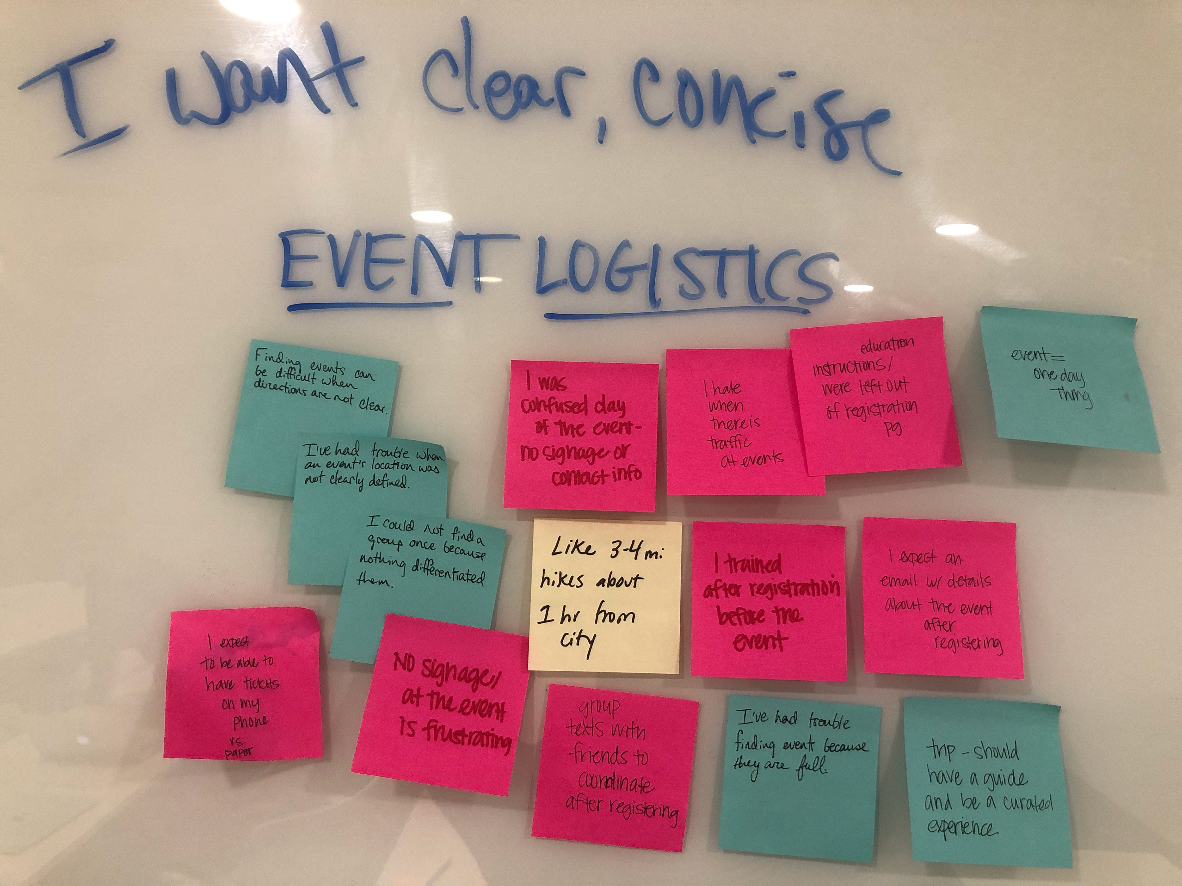
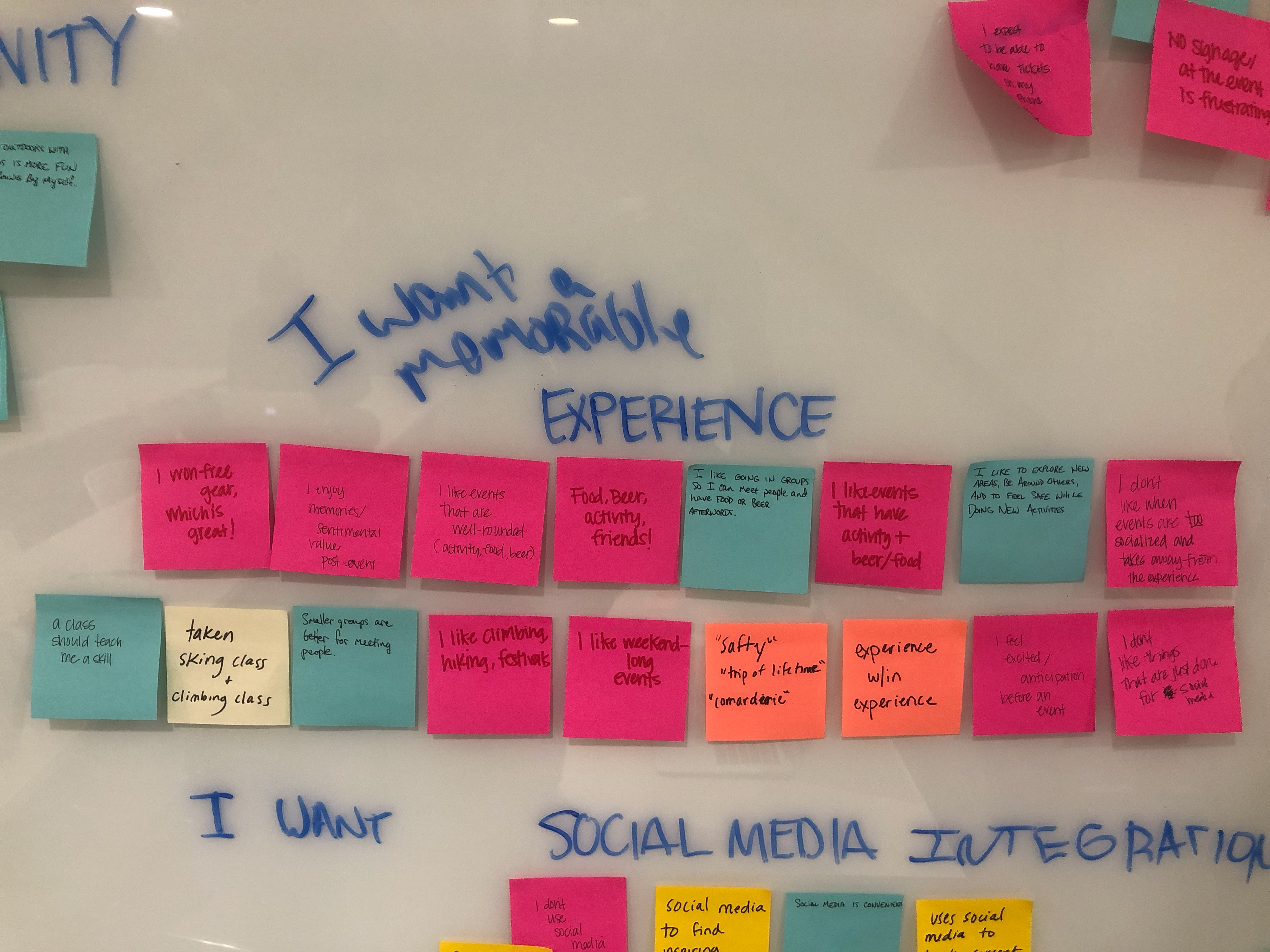
Upon collecting all the data, we synthesized the data and spent a ton of time affinity mapping which helped not only identify pain points and what users wanted out of the experience. What those users wanted also helped us inform our personas.
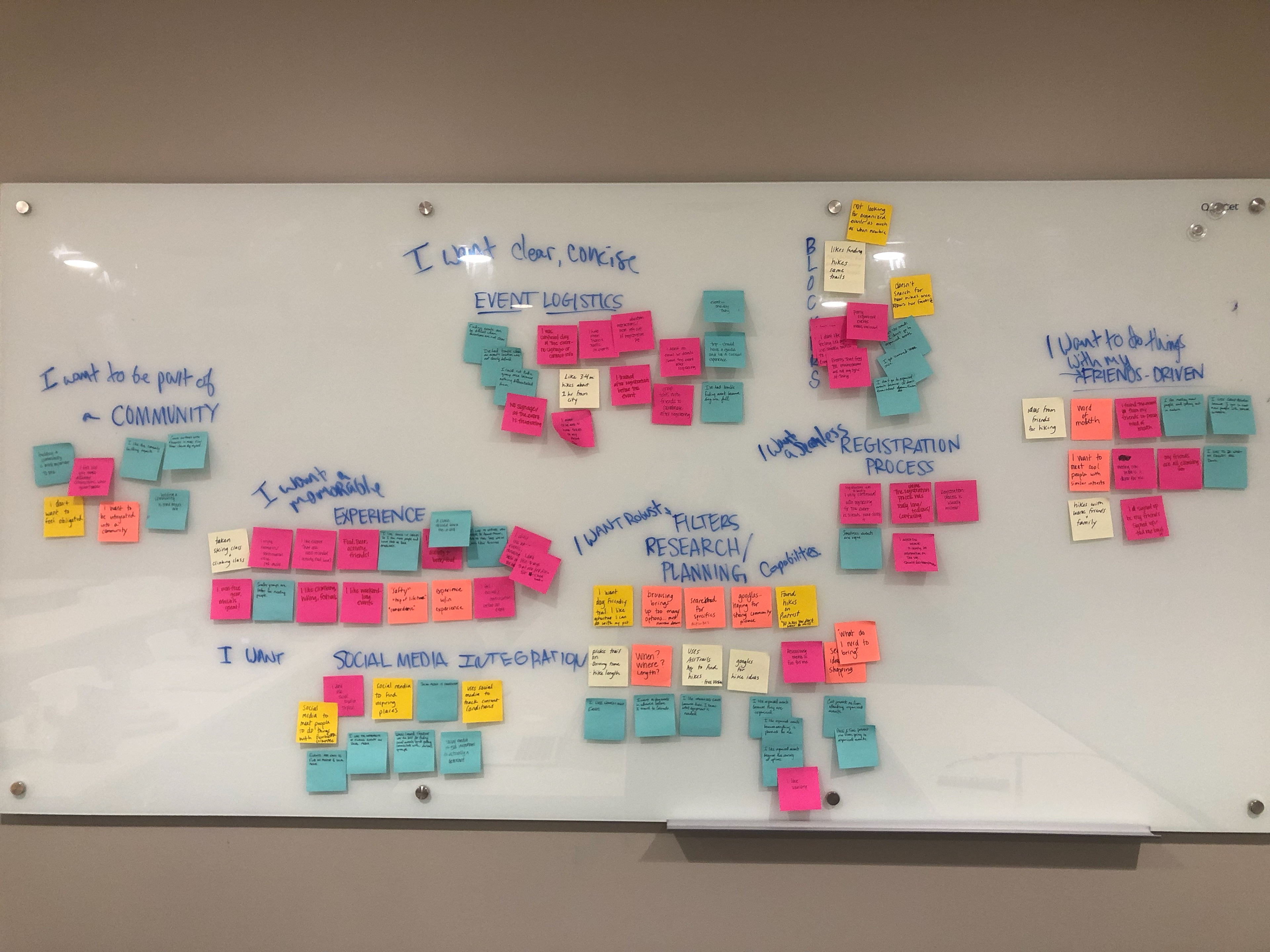

Personas
This is Audrey

This is Paul
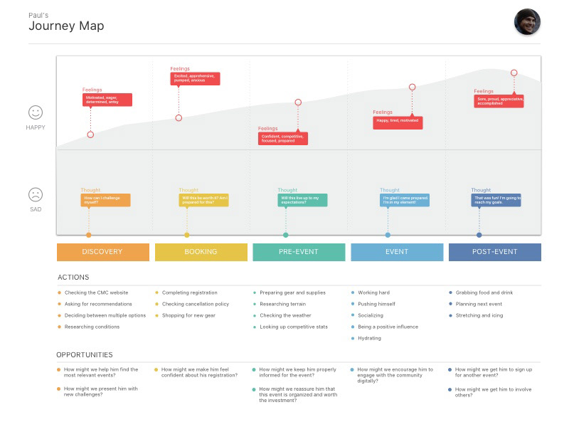
We were able to develop two personas. Audrey is new to Colorado and what we termed a social explorer. Her main focus is to get out and meet new people while exploring an environment that is new to her. Whereas Paul is a peak-bagging, longtime Colorado Mountain Club member whose primary focus is to summit every peak in Colorado over 14,000 feet of elevation.
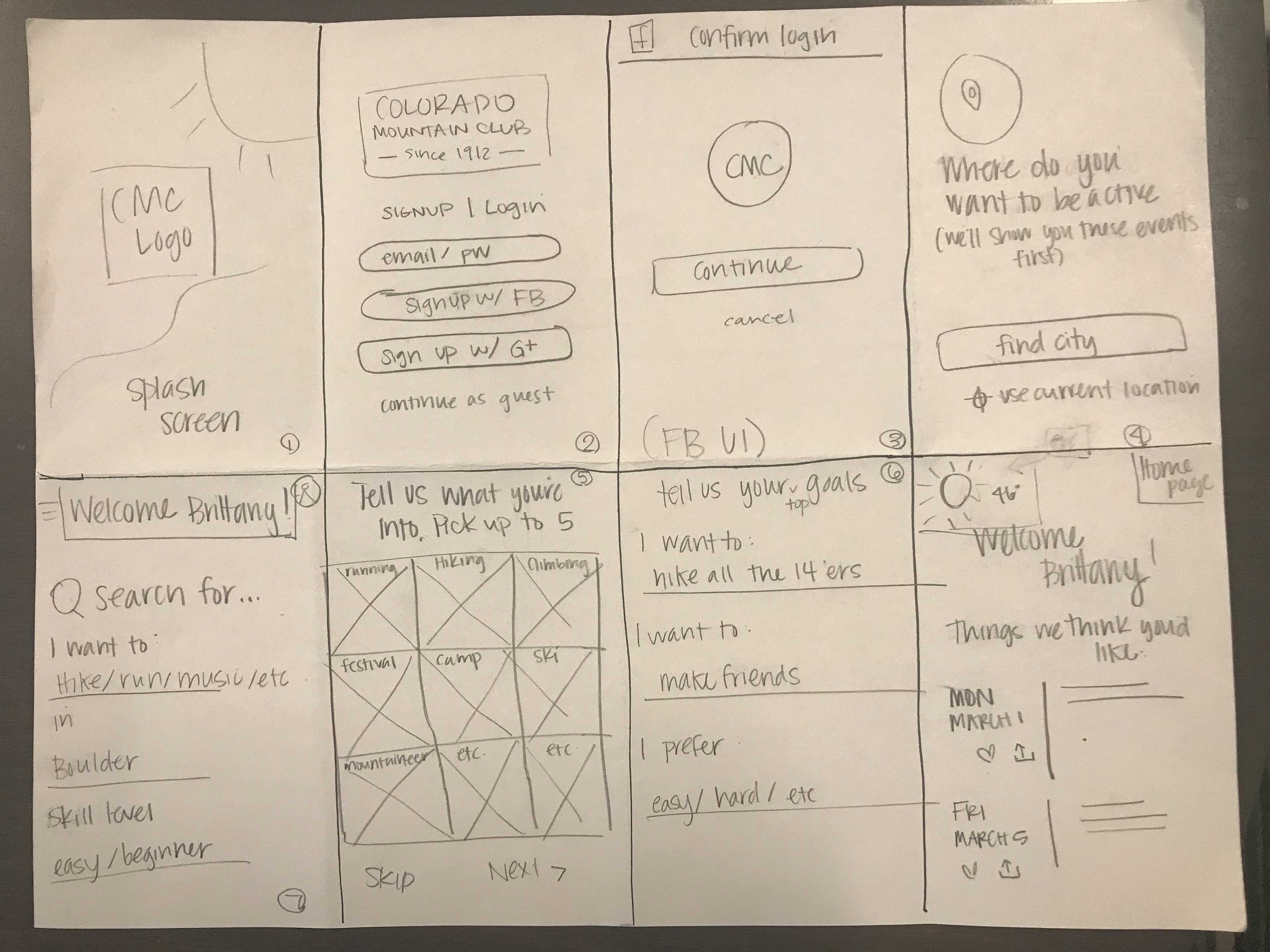
The reason that we settled on these two personas is that they differ both in how they would use the app, as Audrey is onboarding as a new user, whereas Paul represents a more familiar and focused user. With this in mind, I created user flows for both personas and design work began.
Designing a New Mobile Experience
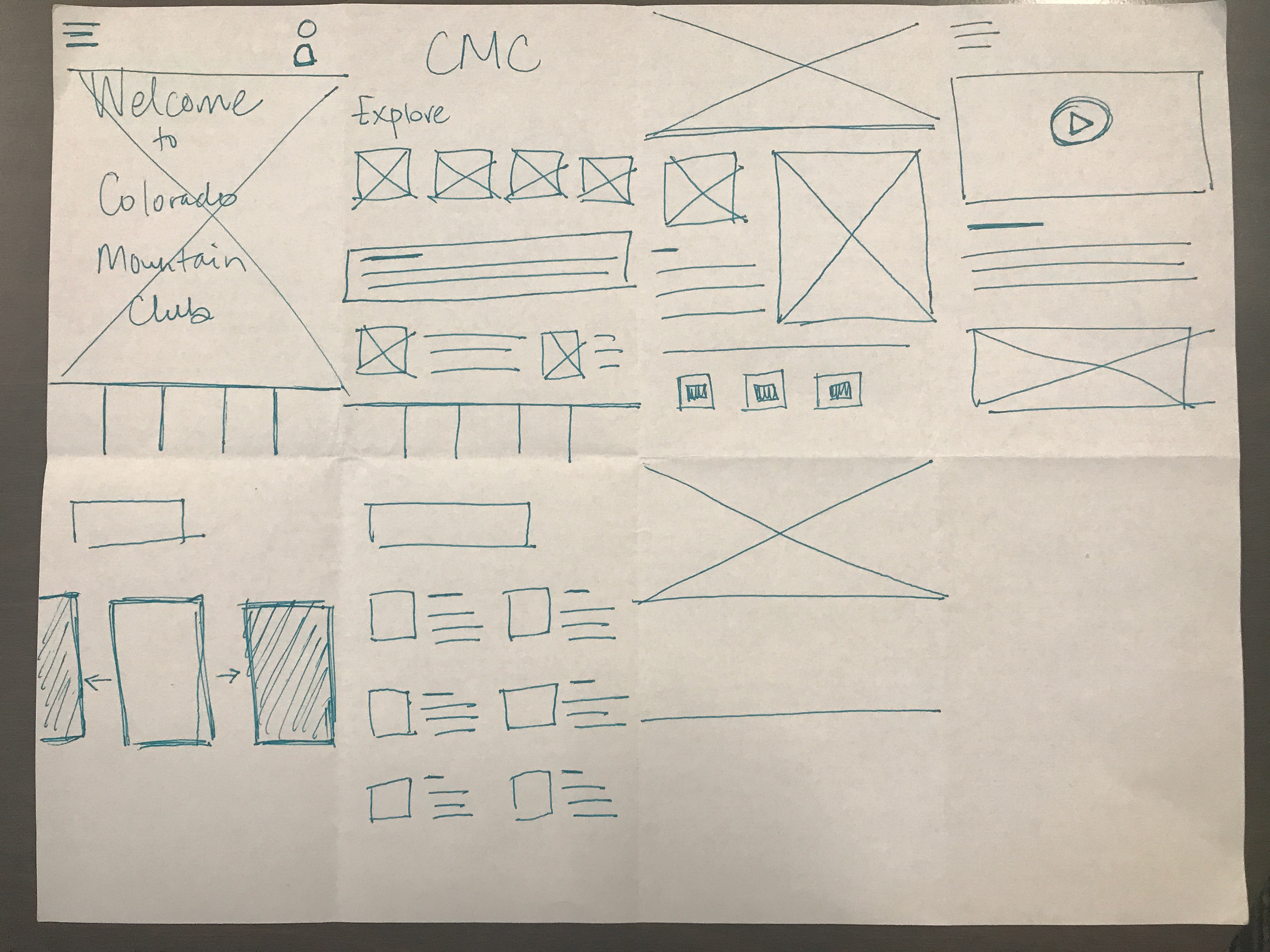
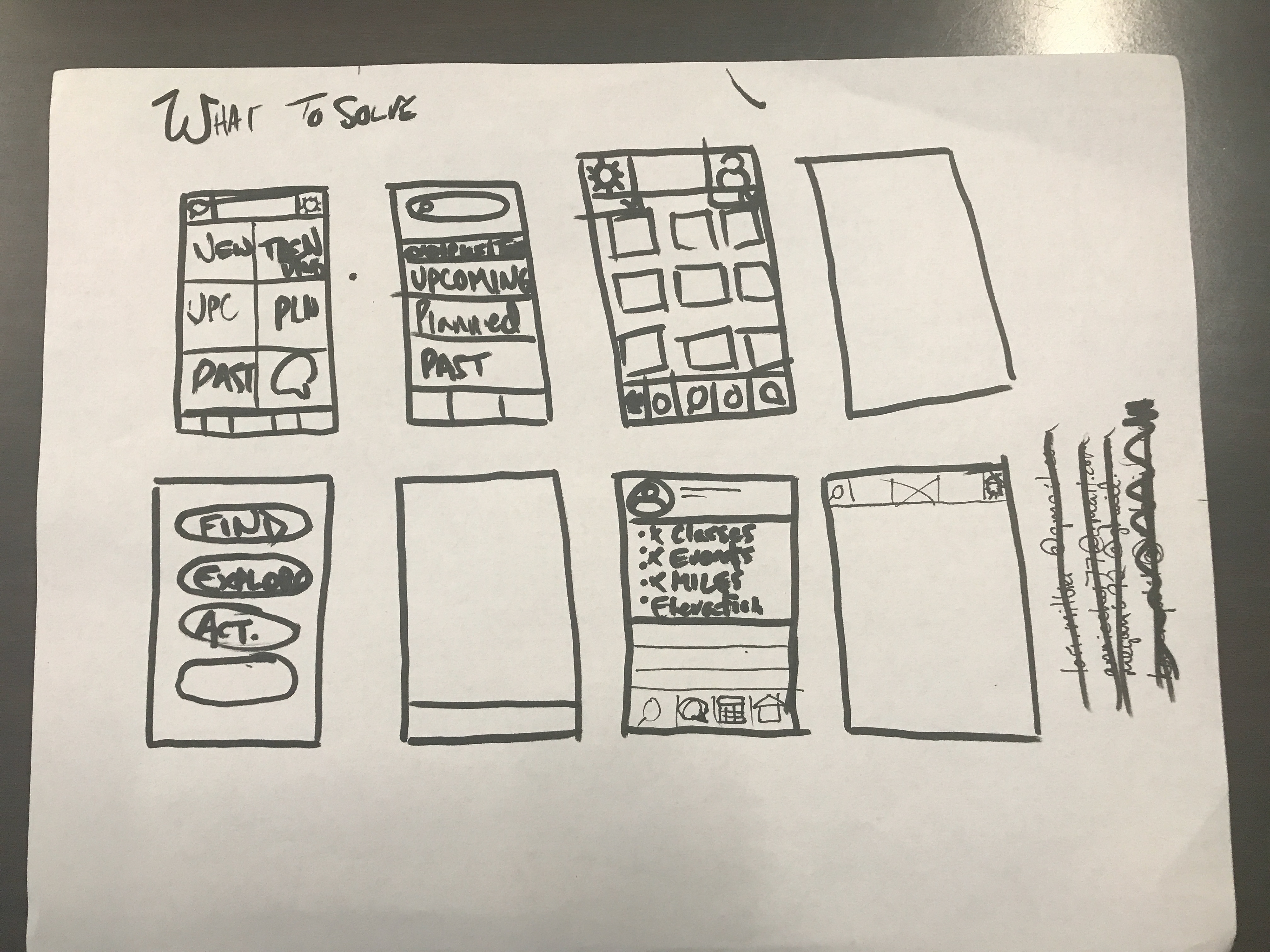
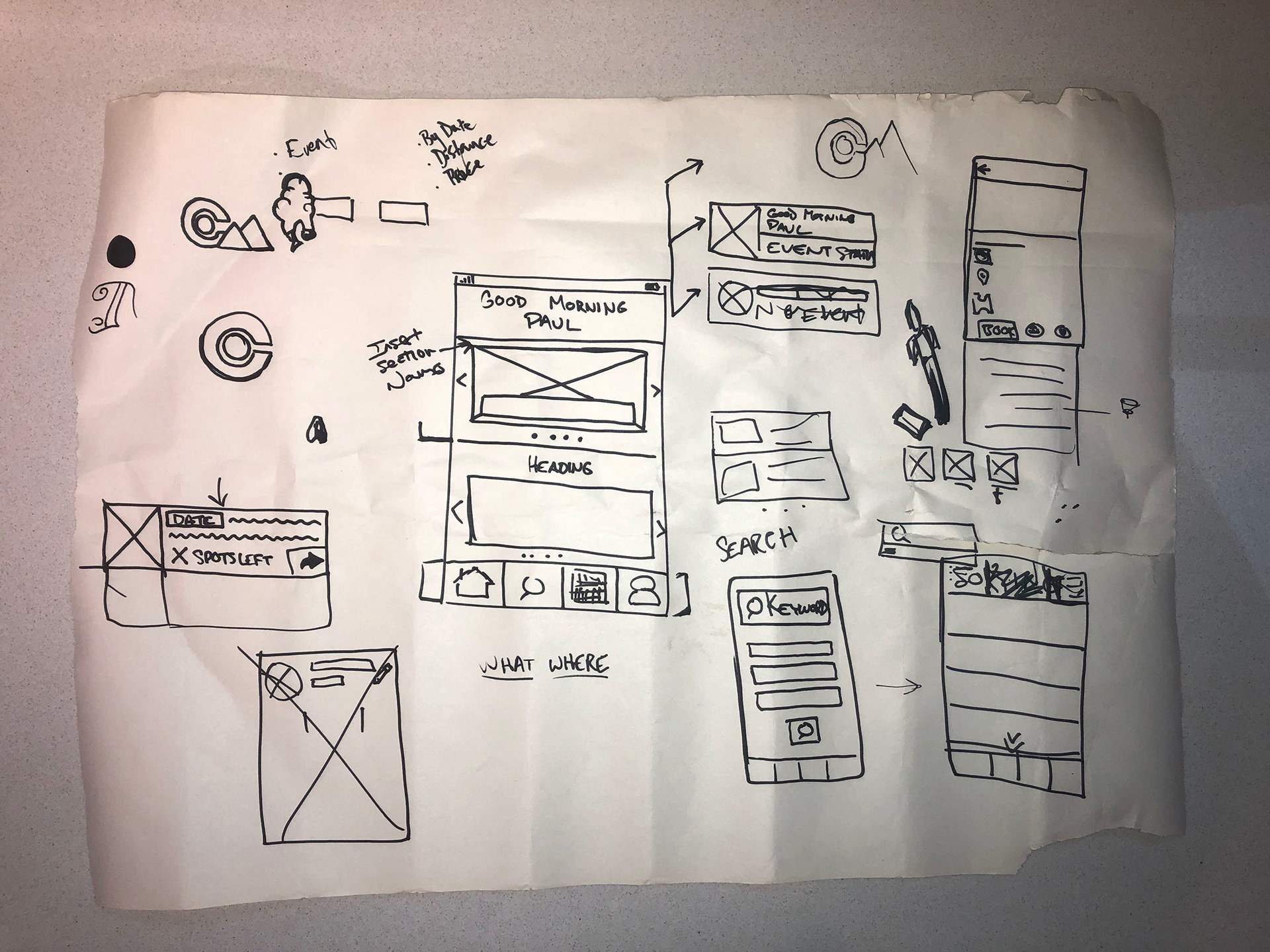
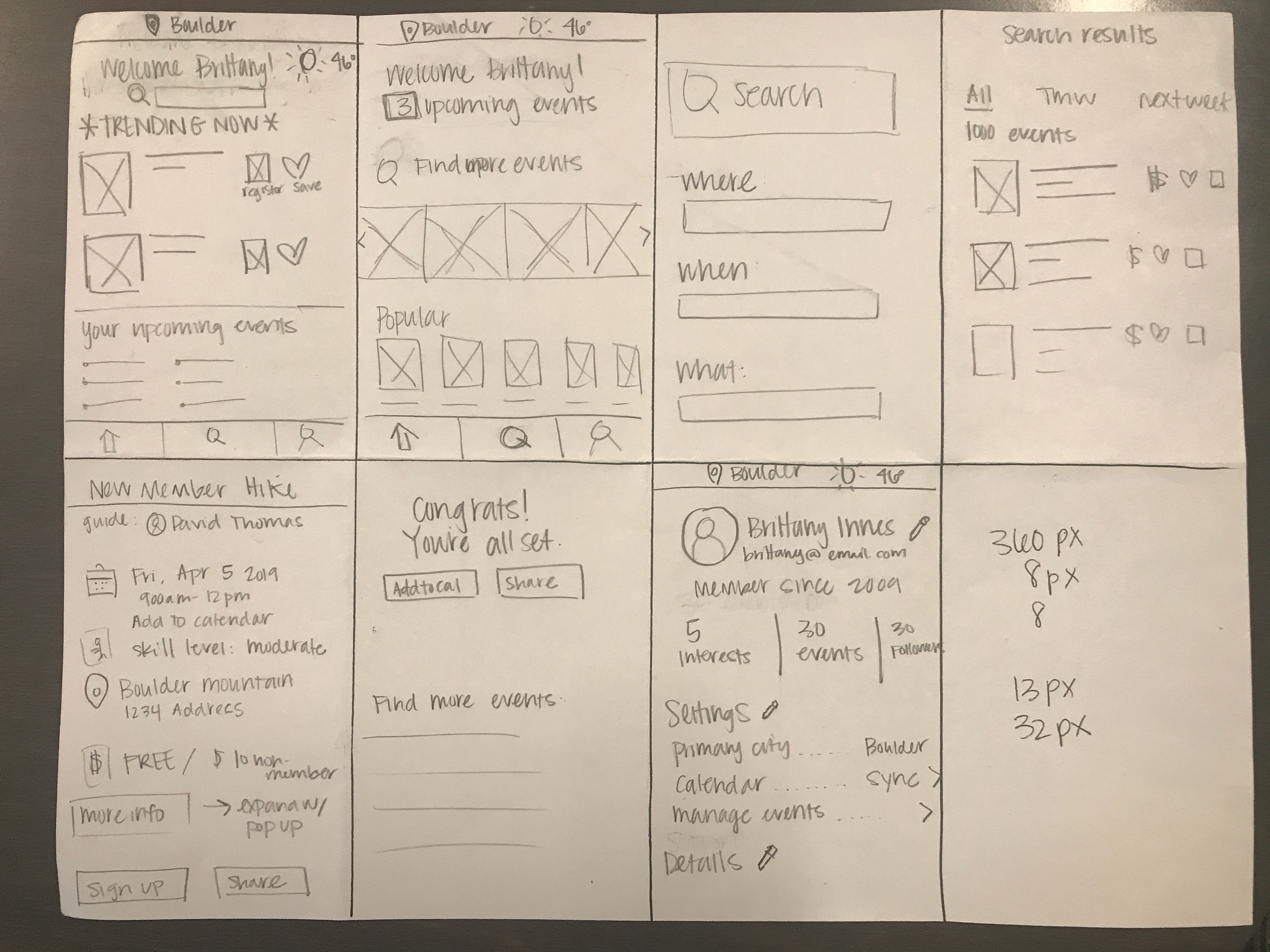
Once we had an idea of who we were designing for, I, alongside my group performed multiple design studies and came up with multiple iterations of all the main pages of our application. Once we had those multiple iterations, we discussed what we collectively liked and disliked, and discussed how we thought the design should go. We settled on a basic wireframe layout and divided the remaining work.


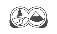
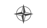
At this point, the group set about to complete their individual tasks. At this point I focused on asset creation, as the Colorado Mountain Club did not have a lot of assets that translated cleanly to a mobile application. As their current logo is text based and would not read well when condensed to a mobile screen, I decided that a new logo would need to be created.
Redesigning the Colorado Mountain Club Logo
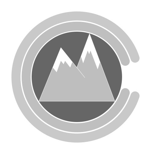
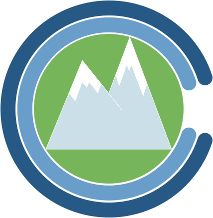
Going into the logo designing process, I determined what I wanted the logo to convey. Since I’m a sucker for hidden imagery, I wanted to incorporate the letters of the organization Colorado Mountain Club, and illustrate what the club was all about. If there’s one thing that is hard to escape in Colorado, it’s mountain imagery, so I looked to the state itself for inspiration.
The state flag of Colorado was designed by Andrew Carlisle Johnson and according to the Colorado Department of Personnel and Administration the colors “symbolize certain geographical features of Colorado. The gold stands for the abundant sunshine that our state enjoys. The white represents the snowcapped mountains while the blue stands for our clear blue skies. The red represents the ruddy color of much of our state's earth.” I wanted to lean into this imagery as Colorado residents recognize it readily and because the CMC is all about getting out and enjoying what the flag is said to represent.
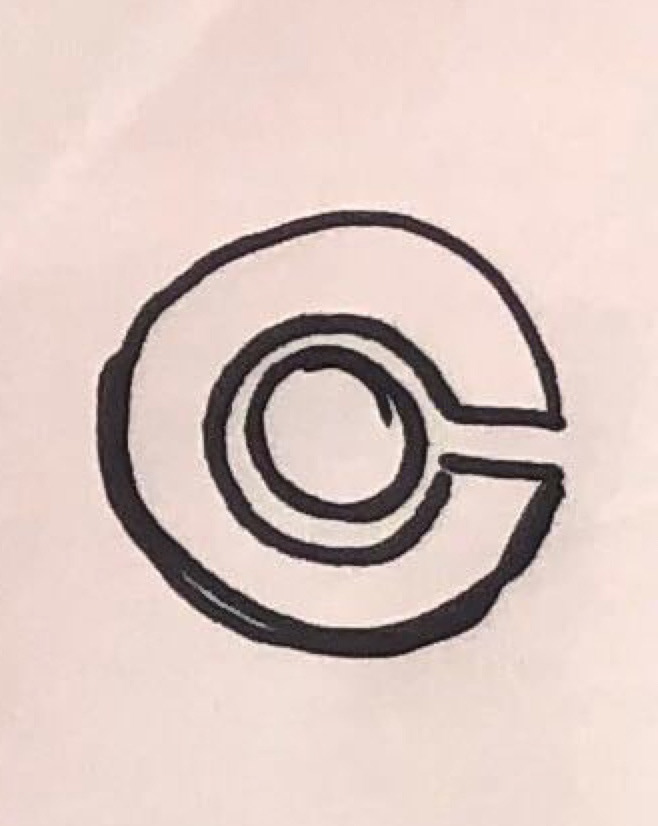
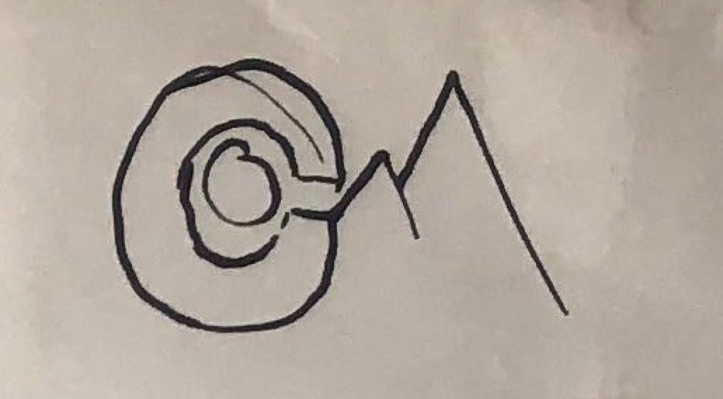
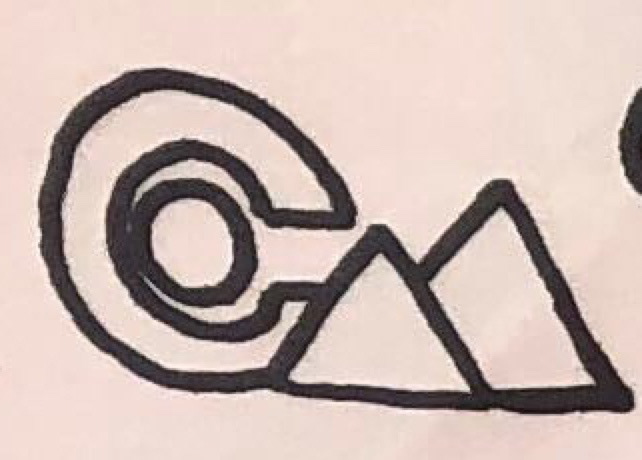
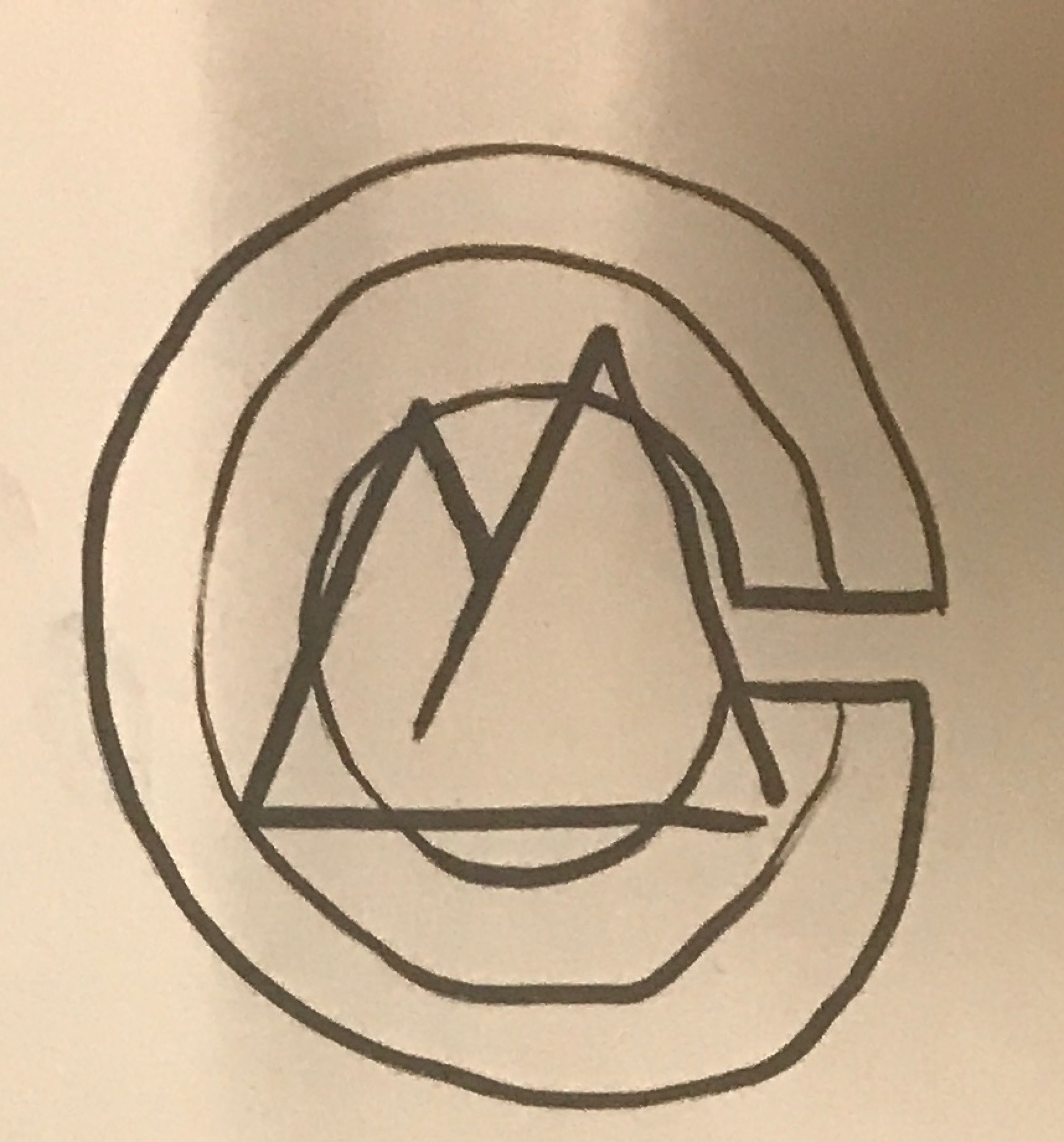
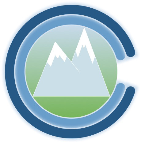
Early sketched iterations of the new Colorado Mountain Club logo were typographical, with typography reminiscent of the state flag for the C’s in the acronym. The M was represented by an asymmetrical mountain design. I then decided to layer them all and create what became the final concept for the new logo. Two radial bars with an equal proportion open segment with a circle inside containing the asymmetrical mountain design. Once the design itself was finalized, I moved on to color. Our team had decided that the color scheme used by the Colorado Mountain Club was perfect for the app, so the color palette was decided. I decided to use the green and light blue gradient as the center of the design to represent hiking and the transition of your environment as you ascend. For the radial bars, I chose to use the remaining two complementary blues from the palette to visually distinguish the bars. As the fidelity on the application was raised from wireframes to mockups, a light blue drop shadow was applied to the radial bars to distinguish them against the background of the app.
Creating Iconography
Our design for Audrey’s onboarding experience included two screens that were built around tailoring her CMC experience, an activities page and a goal page. The designs we wanted to execute for these pages were based upon the idea of selecting cards adorned with icons. I wanted to challenge myself to create all the icons we would use for the application.

Film

Make Friends

First Aid
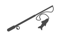
Fishing

Exercise
Get Away
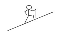
Hike
Learn
Sightsee
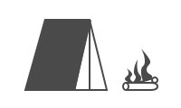
Camp
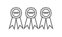
Certifications
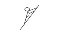
Climb
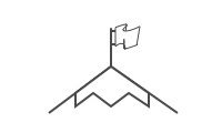
Peak Bagging
Explore
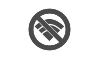
Some of the icons were more difficult to create than the others. The ones exercise and fishing coming to mind as ones that simply made sense. One icon I struggled with was the "Get Away" icon. The original "Get Away" icon morphed with peer input into the "Sightseeing" icon. The idea to repurpose the negative connotation of "No Service" iconography, and to reframe it as "Get Away" allowed us to leverage easily recognizable concepts and apply them within the context of our application.
I also wanted to create unique iconography for the lower navigation bar. While most of these are just reinterpretations of common iconography, I wanted to add a unique touch to the search icon. I added the same mountain iconography from the logo into a magnifying glass to add a small but noticeable branding touch to a constant element within the app.

Bringing it All Together
Once all team members were together and working again, it was apparent that our methods of building the prototype itself were flawed. While we had discussed layout and color and flows, what we had failed to discuss were specifics of text styles and button size and pixel perfect positioning. While I had created a symbol library for iconography, two other team-members had created the two separate user flows. I took the challenge of combining the sketch files and creating a consistent design across both flows, while ensuring the correct implementation of symbols. At this point I passed the file with both flows to a team member to raise the overall fidelity of the mock-up.
The final result of our team's research, design studios, and individual craftsmanship, is a wonderful prototype that strips away the clutter of the Colorado Mountain Club website. We were able to address all of our major pain points from social media integration to concise event details and easy registration.
Video mockups of both Audrey and Paul's flows are below.
Phase 2: Future iteration of this app would include either an expansion or refinement of the onboarding procedure depending on further usability testing. Additional features would also be built out such as messaging, commenting, and other communicative features. A user profile with goal setting and tracking features could be incorporated. In an ideal world, the Colorado Mountain Club app is a way for people to interact with nature, but also the community of people who love getting out and enjoying what nature has to offer.
All Sketch Files available upon request.